30 Best 404 Pages on The Interwebs
Fact: simple 404 pages look like they’re from the Altavista-era Internet. This leaves a scar on user’s experience with your website. Modern users want smart, witty and actually helpful ‘not found’ error pages.
Don’t be the guy who says ‘you broke something’ on his 404 page. User shouldn’t feel guilty about you or your machines not being able to find what he was looking for. More often than not, this is actually your fault – moving things around and not accounting for some pages linking to the content.
Say you’re sorry, explain why the user is here, add some links for a way out that does not involve clicking the red button with a cross in it and entertain your user in a way that will overpower any negative feeling they might have after learning that the page they’re looking for does not exist.
Without further ado – the best 404 pages on the interwebs.
1. Apartment home living 404

A funny illustration of a fading sheep in the bathroom. Ha-ha. It’s memorable, which means people are likely to share it and spread the word about your website. It also has one clear call to action.
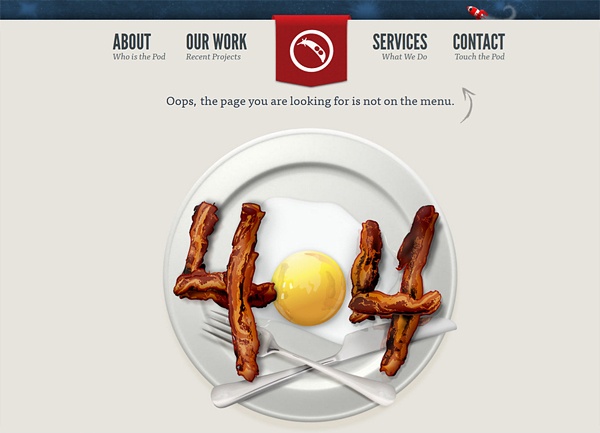
2. Bacon-n-eggs 404
Acting on the ‘everybody loves bacon‘ hypothesis this 404 page reminds you to go and check your fridge, instead of continuing to use the website. Give me all the bacon & eggs you have.
3. Old Illustration 404 Concept
Old Illustration turned 404 page, featuring a Space Ghost in orange suit. Certainly looks cool.
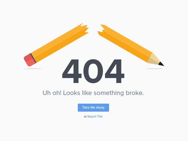
4. Broken Pencil 404 Concept
The link you requested is broken, the pencil on this image is broken too. Clever, witty but not very thoughtful analogy, if you ask me.
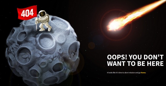
5. Coolappse 404
Cool appse messes with your brains by including “you don’t want to be here” copy and a very strong visual to accompany it. Hard to resist closing that window now.
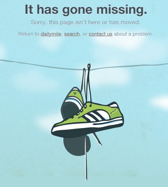
6. Dailymile 404
This is actually a good way to present shoes for some hipster shoes e-commerce website, or a 404 page.
7. Dead Link 404 Concept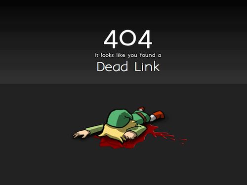
You could say that all biological functions that sustain a living organism (Link) have been terminated. Or you could just say in a matter of fact way: “Dead Link”. Tribute to all Legend of Zelda fans out there.
8. Deezer 404
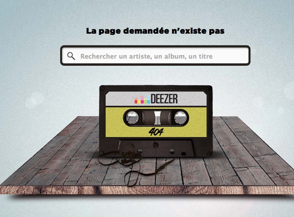
Clever, relates to the service provided and features a prominent search box. Is this the perfect 404 page?
9. Dropbox 404
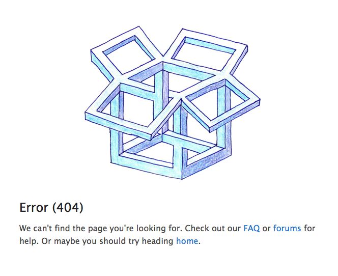
A little something featuring Escheresque box on the 404 page of Dropbox will leave you wondering for some time.
10. Eightbit.me 404
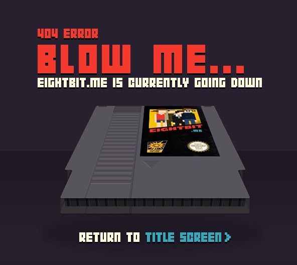
Clever and appropriate for the community eightbit.me is targeting. Good example of how a bad experience of page not found can be transformed into a smile on the visitor’s face.
11. Empty plate 404 Concept
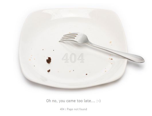
From the empty plate I get that I arrived too late, and the copy below confirms it. However, this leaves me with a feeling that I’ve done something wrong. Most probably I just clicked a link, nothing wrong with that.
12. Treasure Hunt 404
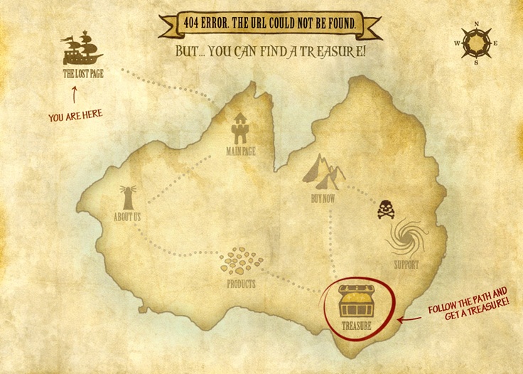
Who doesn’t love a good old treasure hunt? Especially if it ends with a 25% discount, as this one. You didn’t expect that on a 404 page, did you?
13. Formkeep 404
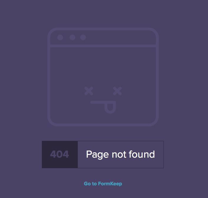
It is what it is. Page not found, 404.
14. Github 404
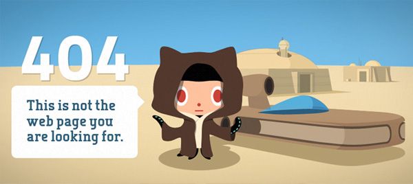
Github takes the 404 game to a whole new level with this Star Wars reference.
15. Heinz 404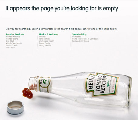
The page is “empty” ( or is it? ) and the bottle is empty too. A little bit forced, but sound for a food company.
16. iStock.com 404
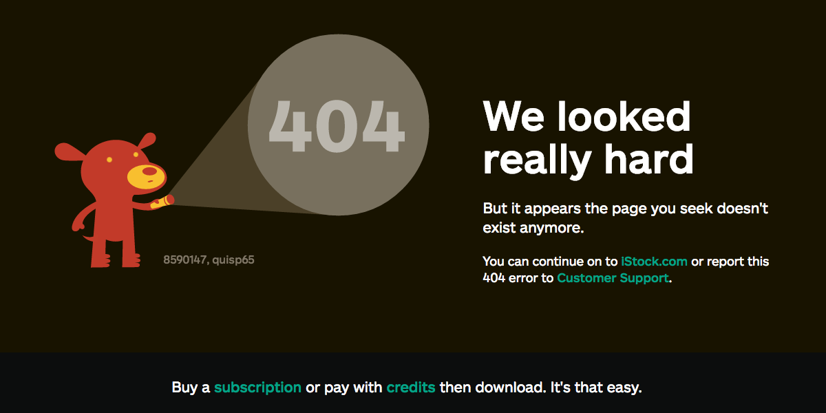
Usually dogs are good at finding things. This particular red guy couldn’t find the page you’re looking for. Does this make you feel better? iStock did everything possible to make you happy here.
17. Jackrabbit 404
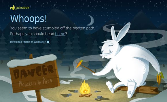
A good visual stimulus to leave the page. Hello? A giant white rabbit eating carrots right in front of you? Leave. now. Not really clear that it’s a 404 page though.
18. Kiss.com 404
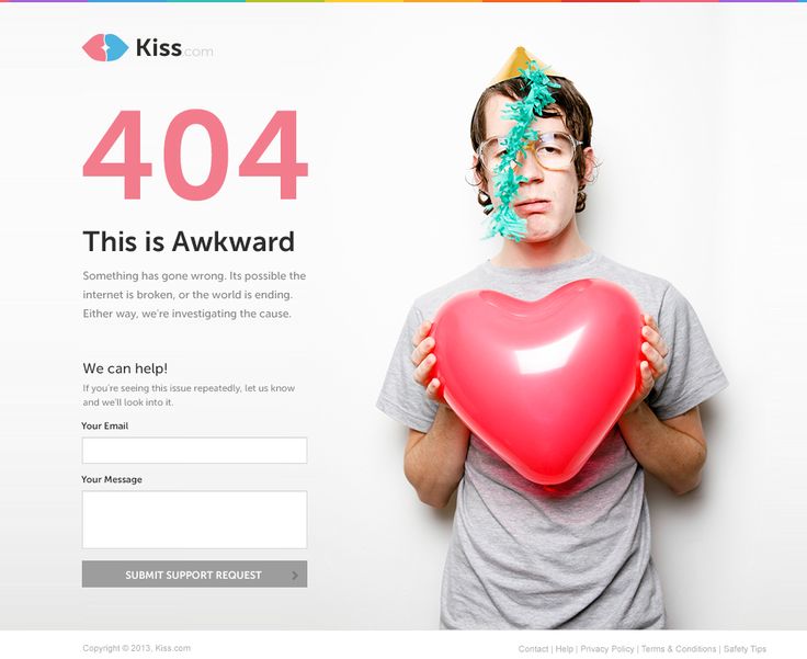
This guy with a red balloon feels your pain and sends you hearts and kisses. Could have taken at least some responsibility for the broken link, instead of blaiming the Internet, amateurs.
19. Mailchimp 404
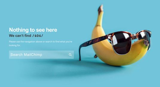
Banana with sunglasses. Why didn’t *you *think about this when brainstorming visuals for your 404 page?
20. Missing Link 404 Concept
Love the milk box missing link picture. Add a simple “Wait, I know this guy..” copy, ‘Call the cops’ button and you have a 404 page ready to go live.
21. Moz 404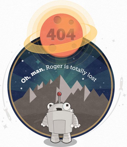
Perfect example of taking responsibility for the screw-up, while entertaining the visitor with a cool visual at the same time.
22. Naked Man 404 Concept
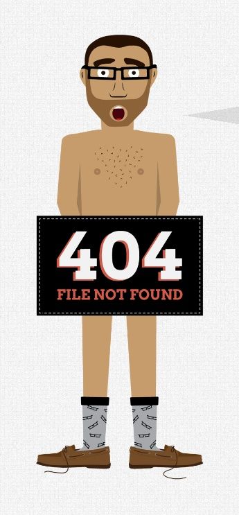
It’s certainly unexpected and maybe even a little funny. But the connection to the “file not found” is not as clear as it could be.
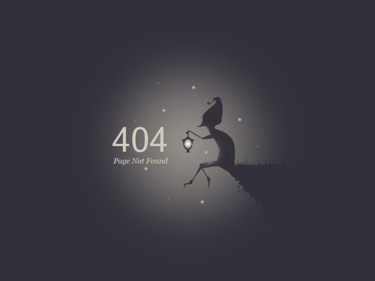
23. Night Lantern 404 Concept
Very dark 404 page. Not only because of the color, but due to the feeling this page leaves you with. It has a “all hope is lost” kind of vibe to it.
24. Piccsy 404
My eyes hurt a little bit, but in a good way. Like when you stare at the sun a little longer then you should and then smile because it just feels nice and warm. What’s that? It’s just me? Nevermind then. Moving on.
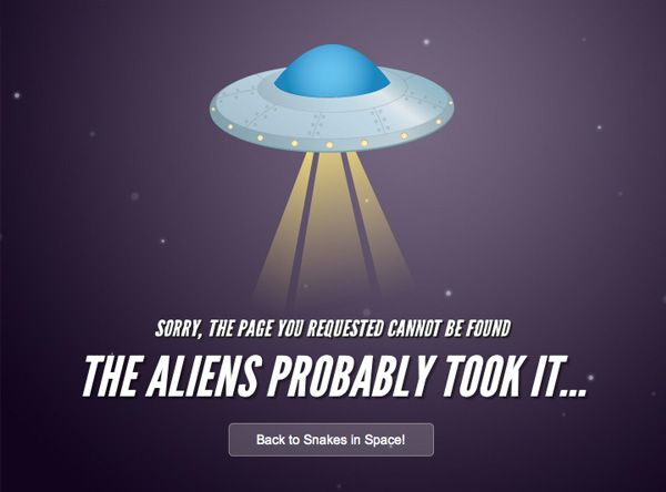
25. Snakes in space 404
A common theme in 404 page design – alien abduction. Guys at Snakes in Space are stealing it. Entertaining and makes me forget the pain from not seeing the page I actually requested.
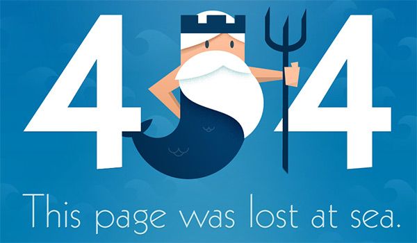
26. Splashnology 404
Matter-of-fact statement from Splashnology. The page was lost. At sea. Deal with it, aight?
27. Storm trooper 404 Concept
Another Star Wars reference. Or is it the same one? Must be very good then. Move along… Move along…
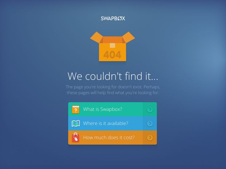
28. Swapbox 404
The website is called swapbox. There’s an empty box with 404 on it on screen and “we couldn’t find it” message. What more do you need? Just click on one of those buttons and be done with it.
29. Vasa Museum 404
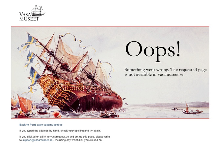
Not all of you are designing pages for startups, why not take example from a different world. This 404 page from Vasa Museum incorporates a clever “something went wrong” visual, highly relevant to the topic of the website.
30. StudySoup 404
Are you a college kid looking for notes to the classes you missed? StudySoup captured the essence of your struggle perfectly.
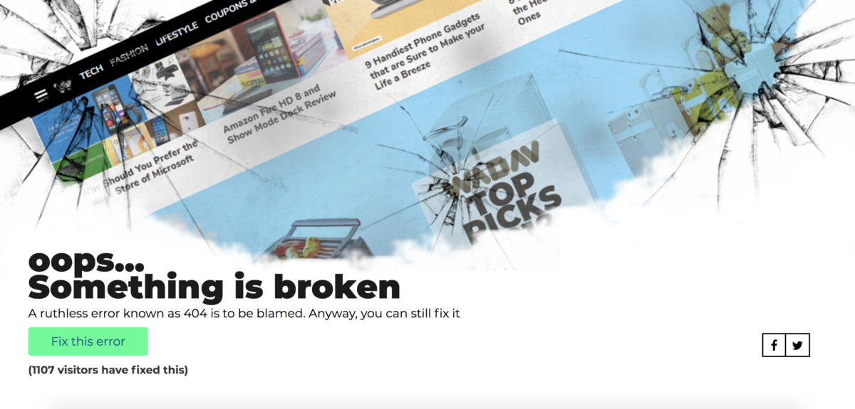
31. Wadav 404
Wadav offers you to fix the error yourself. This leads back to homepage with a thank you note for fixing. Brilliant!
Over to You
Have you seen any good 404 pages? Which 404 page did you like the best? Do you have a cool 404 concept you’re working on? Let me know in the comments section below.


