New Sellfy Product Checkout
Good news everyone! Your products now have a brand new checkout. It’s bigger, it’s better, it’s more user friendly.
The best part? New product checkout is optimized for conversions, which means more sales for you. Yay!
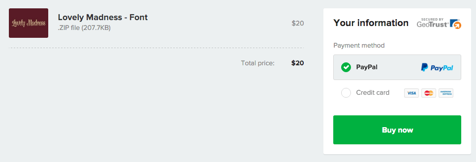
If you still haven’t seen it in action, here’s a quick preview of the checkout screen for Lovely Madness – Font by Micro Zett.

What about my customers purchasing from mobile devices?
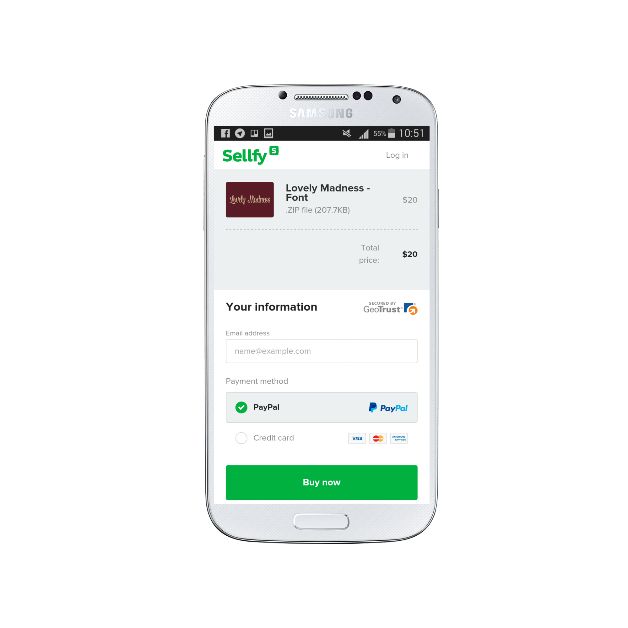
The checkout is also mobile responsive, so your fans can finally purchase your products from the comfort of their sofas at home using smartphones or tablets.
What do I have to do now to enable new product checkout?
Nothing. Nada. Nichts. All product checkouts have been automatically changed to incorporate the new design.
P.S. As always, if you have any questions or concerns about the new checkout – please contact our support.
What do you think about the new checkout? Is it everything you ever wanted it to be? Is there anything we can improve about it?


