Creating mobile-friendly PDFs: best practices for your PDF products

With the increasing use of smartphones, your content must be user-friendly on all devices.
People are constantly on the go, and your PDF products are frequently purchased and consumed on mobile devices.
The good news is that any PDF document can be made mobile-friendly. Today, you’ll learn how to do just that as I’ll cover best practices, tools, and more.
What is a mobile-friendly PDF?
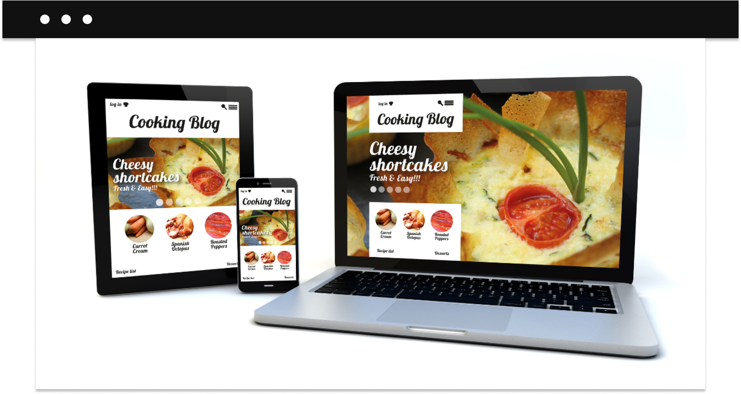
A mobile-friendly PDF is designed to be easily read and used on mobile devices. They are designed for smaller screen sizes and ensure users can interact via touch screen. It’s called responsive design and ensures your digital products can be used on different devices including smartphones, tablets, etc.
Key differences in screen sizes, resolution, and user interaction
Desktop and mobile devices differ in screen size and resolution:
- Desktops typically have larger screens and higher resolution, such as a 24-inch monitor with 1920×1080 pixels.
- Mobile devices have smaller screens and varying resolutions, like a smartphone with a 6-inch display at 1080×2340 pixels, making it necessary for PDFs to be simpler and have simpler designs.
Responsive design ensures your PDFs adapt to any screen size and resolution, making them easier to download and read on any device.

Tools and software for creating mobile-friendly PDFs
You can create mobile-friendly PDFs using different tools and software. Here are some of the most effective ones:
Adobe Acrobat Pro DC
Adobe Acrobat Pro DC is a paid tool that allows you to create, edit, and optimize PDFs. This tool can reduce file size, adjust fonts, and customize layouts.
Foxit PDF editor
Foxit PDF Editor has similar functions but is more affordable and easier to use. It includes features for reducing file size, optimizing images, and adjusting layouts for mobile devices.
Nitro PDF Pro
Nitro PDF Pro offers robust features for creating and editing PDFs, including compressing file size, optimizing images, and adjusting layouts for mobile use.
Smallpdf
Smallpdf is an online tool that provides a wide range of PDF editing features, including compression, image optimization, and layout adjustments for mobile devices.
PDF-XChange Editor
PDF-XChange Editor is another popular tool that offers extensive PDF editing capabilities. It allows you to reduce file size, optimize fonts and images, and adjust layouts to make PDFs mobile-friendly.
Sejda PDF Editor
Sejda PDF Editor is a web-based tool that provides many features for creating and editing PDFs. It can help you reduce file size, optimize images, and adjust layouts to ensure your PDFs are mobile-friendly.

How to make a mobile-friendly PDF
Here are the key steps to help you make your PDFs look good and work well on mobile devices.
1. Reduce the size of your PDF
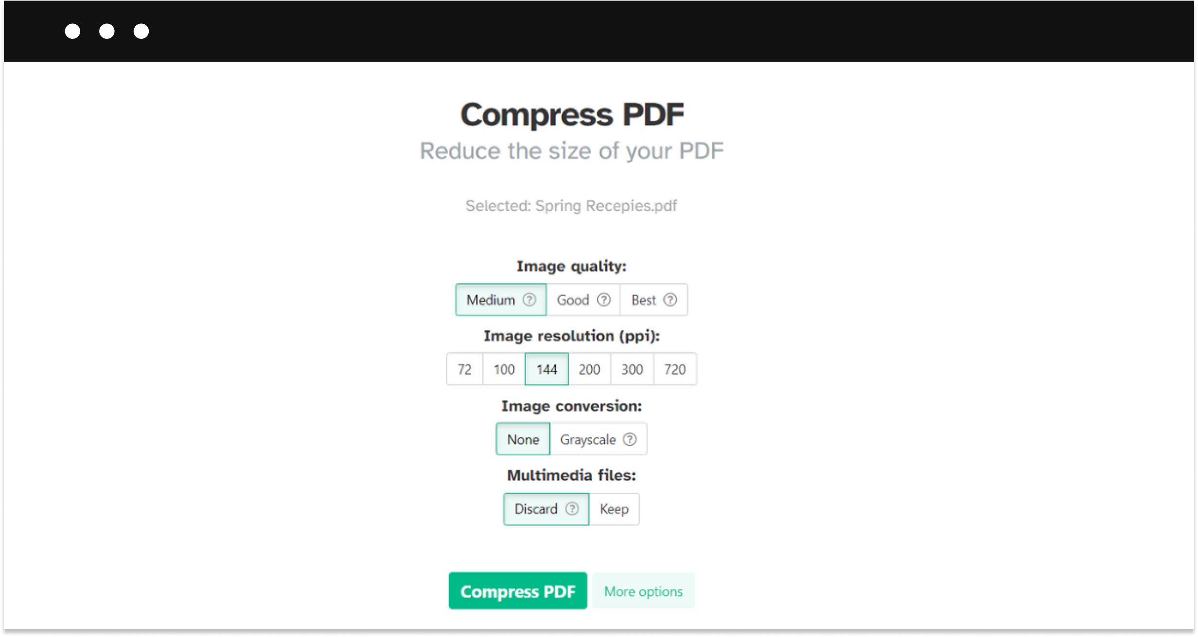
Smaller files load faster and use less data, which are crucial criteria for mobile users. Tools like Adobe Acrobat and Foxit allow you to compress your PDF without sacrificing quality. An optimal size for a mobile-friendly file is generally under 5MBas they load quickly and use minimal data while maintaining good quality.
2. Reconsider the design
- Font and size. Choosing readable fonts and appropriate sizes is critical for legibility on small screens. Sans-serif fonts like Arial or Helvetica work well; a font size of at least 12 points is recommended.
- Layout and scaling. Using a single-column layout makes it easier to scroll through the PDF on a phone. Make sure everything adjusts correctly to different screen sizes so it stays easy to read and use.
- Simplicity in design. Keep your design simple to make it easier for users. Use plenty of white space to improve readability and ensure your layout is clear and easy to understand.
3. Optimize images and media
Use high-quality images that load quickly. Check how the images look on different devices to ensure they display correctly and keep quality.
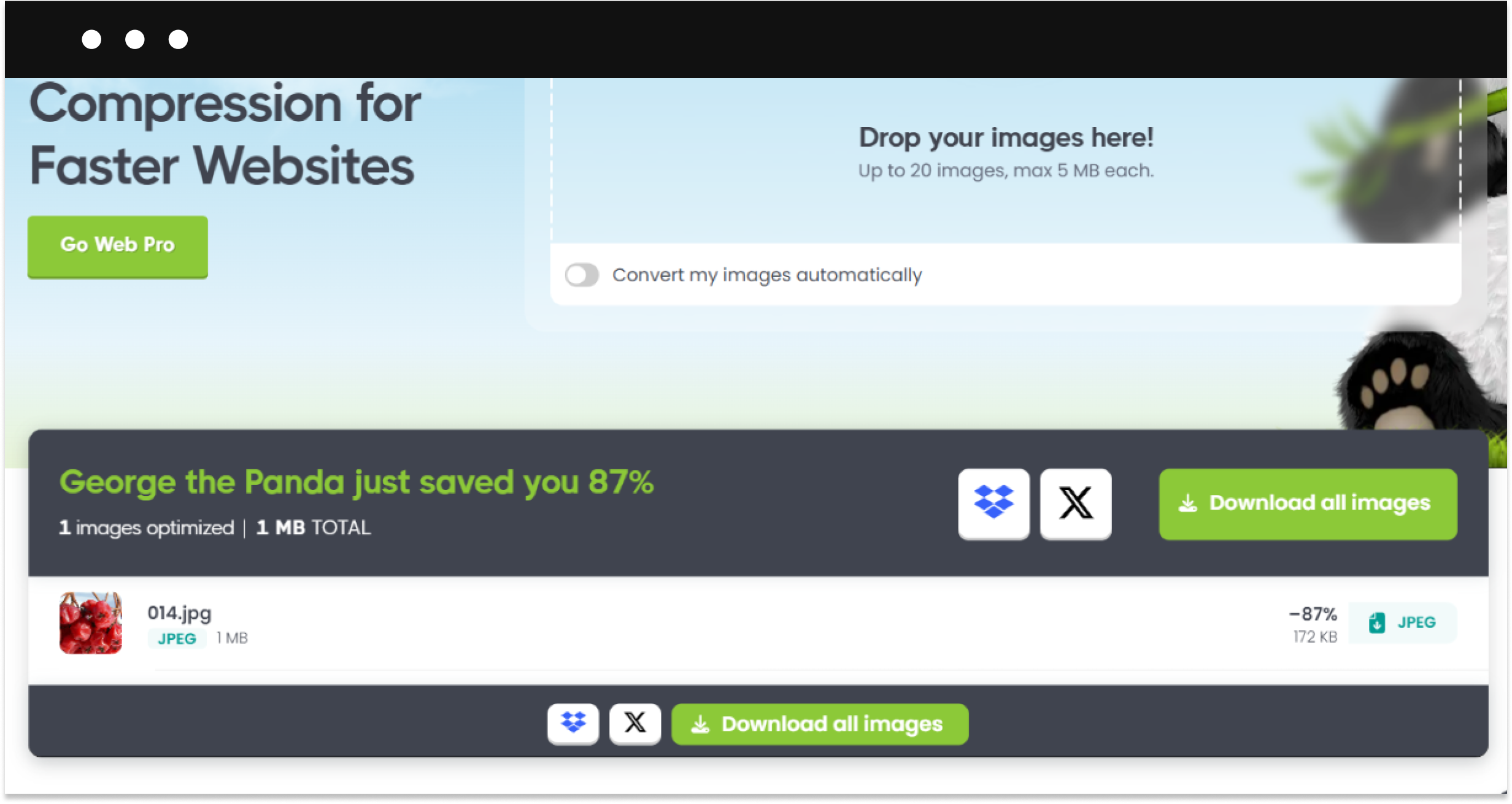
- Using image compression tools like TinyPNG or JPEG Optimizer can help.
- Use formats like JPEG or PNG that balance quality and file size.
- Ensure your images display correctly and maintain quality on various screen sizes and resolutions.

4. Work on navigation and interactivity
Good navigation and interactivity make your PDF easy to use on mobile devices.
- Add a clickable table of contents to help users jump to sections quickly.
- Include touch-friendly elements like:
- Buttons. Use large, easy-to-tap buttons for actions like “Next Page” or “Download.”
- Hyperlinks. Ensure links are easy to spot and tap without zooming in.
- Forms. If your PDF includes forms, make sure the fields are easy to fill out on a touch screen.
5. Test your PDF across devices
It’s important to test your PDF on different mobile devices and platforms. Use tools like Adobe Acrobat’s Mobile Preview or online services like BrowserStack to make sure it works well everywhere.
- Use mobile preview tools. Adobe Acrobat’s Mobile Preview feature allows you to see how your PDF looks on different devices.
- Online testing services. Services like BrowserStack let you test your PDF on various mobile platforms and screen sizes.
- Manual testing. Open your PDF on different phones and tablets to check for any issues. Look for problems like slow loading times, images not displaying properly, or buttons that are hard to tap.
Over to you
Creating a mobile-friendly PDF is important to make sure your content is easy to access and use whether you’re looking to sell your PDFs or simply share with your colleagues. Follow the tips above to make the user experience better, reach more people, and make your content more effective.
FAQ
Why should a PDF be mobile-friendly?
A mobile-friendly PDF is designed so people can easily read and use it on smartphones and tablets, which are increasingly used for viewing digital content.
What makes a mobile-friendly PDF?
To be mobile-friendly, a PDF should have a simple layout, easy-to-read fonts, optimized images, and touch-friendly interactive elements.
Will the quality be lower in a mobile-optimized PDF?
No, a well-optimized PDF keeps high quality while reducing file size and improving readability and functionality on mobile devices.


