How to make product images that capture viewer’s attention?
Most of the people who see your designs will spend less than 5 seconds deciding whether they are interested in it or not.
You spent months brainstorming what your next design project should be, weeks making the project come to life, days on SEO for your product page and then the same amount of time on promoting your designs. And yet it all comes down to these 5 seconds.
Why not spend a little more time and effort on making a good first impression? Especially when it’s so easy once you know where to look.
Feeling lazy? Just download this checklist of all the things you have to check before publishing your product image the next time. GIMME!
**
## Grab their attention
The very first thing you’ll need to do is check if your product image just showcases your design or really communicates value?
Ask a friend to look at your design for five seconds only, and then ask him what is it that you’re selling. This five second test serves as a quick reality check: this is where you decide if you need to completely re-design your product image or is it good to go.
Pique their interest by showing what your product can do for them
One way you can prove that your product is the thing your viewers are looking for is by showing how it can help them. What can your product do for them, that other products can’t? How will it solve their pain points?
Don’t just show your product, customers really couldn’t care less about it. They only care about themselves, and that’s perfectly fine. What you need to do is adjust to that.
Use before/after images
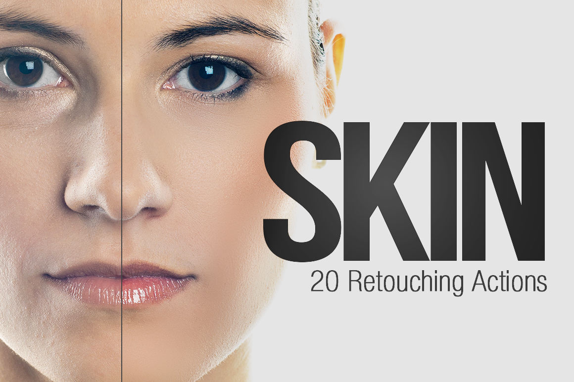
Use before and after images to clearly show the benefits of using your product. Obviously, this does not apply to all products, but should be used whenever it makes sense to do so.
Think of all the ads of skincare products you see in magazines (do you still buy those? really? it must be damn good). Why have they been consistently displaying the before/after images for years now? Because it works.
The Instagram girls who post their fitness progress and sell gym (or diet) plans have picked up on this a long time ago. You can use this technique too, provided that you sell a product the value of which can be easily grasped by looking at before/after images.
KISS (but tell exactly what your customers will be getting)
You know the “Keep it simple, stupid” (KISS) mantra, right? So why don’t you use it, like you’re supposed to?
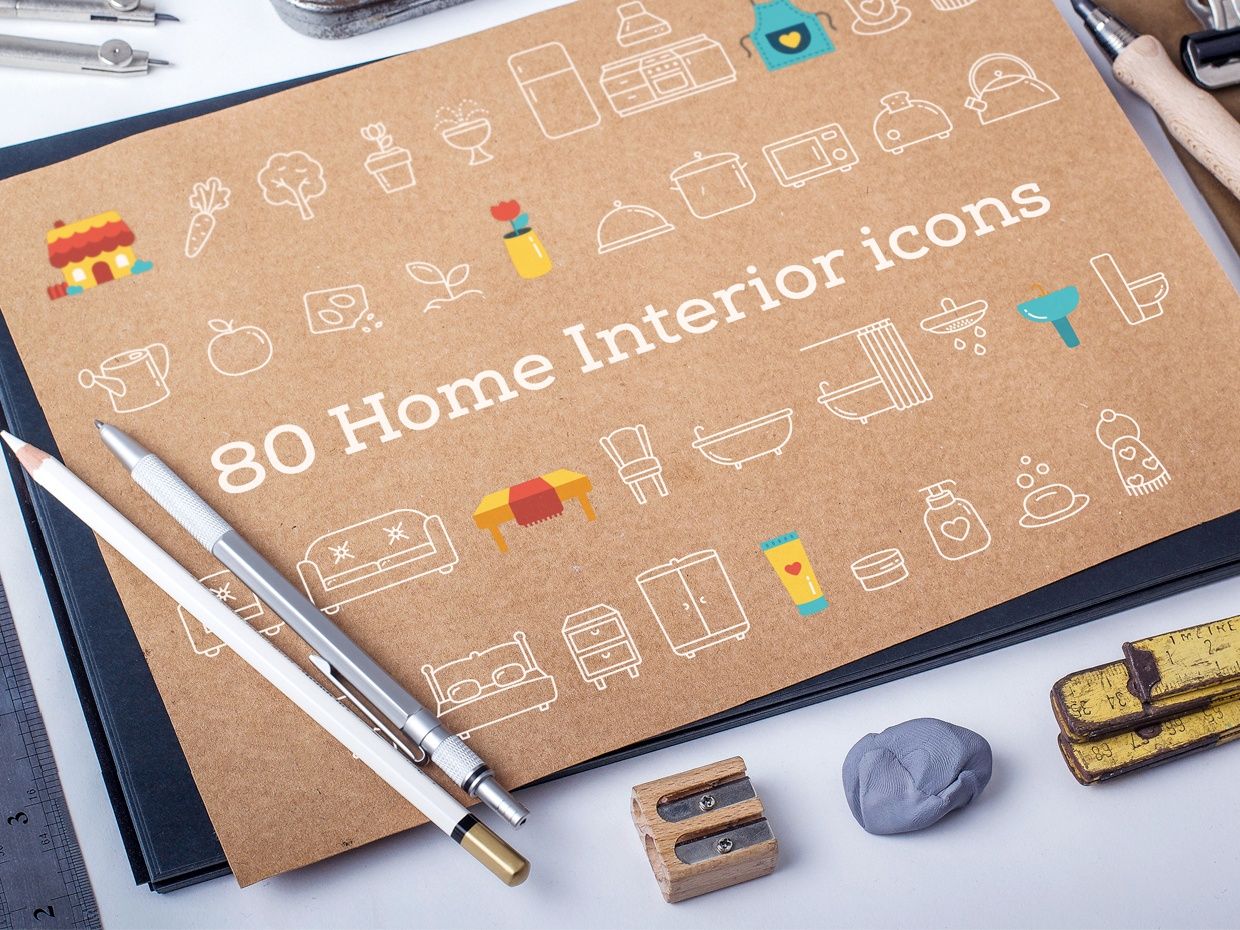
Your customers want to know if this UI Kit will work both for Photoshop and Sketch. You know they need to know it, you’ve seen them asking about it in comments or in social networks. Use this knowledge, tell them what they’ll be getting. How many files or items are included, what systems are supported?
Use short sentences, no more than 10 words per image
There are a lot of creators out there who just can’t keep it precise and concise when it comes to writing text on their product images. This results in a wall of text that spoils any chance of good first impression you might have. Don’t be one of those creators. Limit yourself to 10 words at most.
Product images should have value on their own
Imagine that someone stumbles upon your image via searching for images on Google. There’s no other information available and the viewer doesn’t know what is it that you’re selling and who is the author.
Be aware of the context
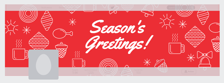
Make sure you properly account for the environment where you image will be displayed. A good example of this is designing cover images in Twitter – they have this ‘blind spot’ where the avatar will go. If you don’t remember this detail when designing your cover image, some of your image text or other crucial elements of your design may be not visible to the viewers.
What does this has to do with selling digital products? Everything. Just look at the way your goods are displayed in the product listing or on the marketplace. Notice how your images are resized, what is the colour of the background, are there any elements similar to Twitter’s avatar that can block parts of your image?
Details matter
Don’t mess this up. If your image has spelling errors or poorly cropped images, how can the customer trust you to deliver a high quality product? He’ll just laugh at you and move on with his day. What can you do to prevent this?
Check if everything looks OK once you’re ready to upload your product. Maybe even double-check it the next day, just to be sure that late night submission didn’t negatively affect your vision (or judgement).
SEO power
Keep in mind that once you upload an image the title it has will be used by Google to help people display relevant results for their search. If your selling “retro steam punk pirate font“ it may be a good idea to rename your title from “screenshot_12_23_2014.png” to something more appropriate. Otherwise both search engines and potential customers will not be able to find your work.
Consistency and brand identity
If you’re serious about your business of selling digital goods, you probably have a couple of items on sale. Good for you. But do you have a consistent style in the way you present your products? Is it easily recognisable? Can people guess that this product was designed by you, only by looking at your product image?
If the answer to any of these question is no, you know that you have some work to do.
P.S. Feel free to download this checklist for the next time you’ll design a product image. GIMME THE CHECKLIST!
**
## Over to You
Are your product images up to the task? Is there enough juice in there to prompt your customers to take action and buy your designs? Have you found any of these tips useful? Let me know in the comments section below.


