11 t-shirt and ink color combinations that work insanely well

Shirt color combinations matter in eCommerce.
Here’s why:
Color has a major influence on the way a brand is viewed by the audience. It only takes 90 seconds for someone to evaluate shirt and ink color.
Moreover, selling something as simple as a tee has become increasingly competitive in a world full of creators.
So, how do you stand out from the crowd? How do you know what colors work well together?
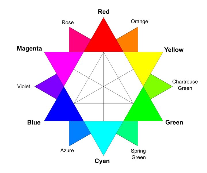
To help you design shirts for selling online, we’ll introduce you to the best screen print color combinations:
- Monochromatic colors
- Analogous colors
- Complementary colors
Source
We’ll also take a brief look at the principles of color theory and color psychology in marketing so that you can have a better understanding of why certain shirt color combinations work.
Ready for some inspiration? Let’s check out 11 different shirt color combinations!
Monochromatic shirt and ink color combinations
Monochromatic colors are lighter and darker colors of a single hue. Even style icons like Audrey Hepburn and Jackie Kennedy preferred monochromatic outfits.
Use monochromatic colors if you want a harmonious, low-contrast, and minimalistic design that is easy on the eyes.
Blue & navy blue
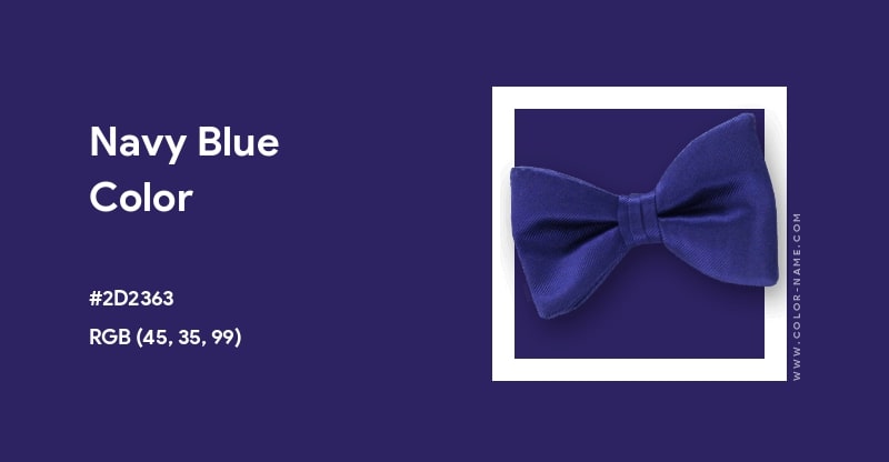
Recommended Sellfy product color combination: shirt Navy & ink #D7E5F0.
What is the most popular shirt color? A global survey conducted by YouGov revealed that blue is the most universally loved ink color. It’s not very surprising as blue has often been called the world’s favorite color for ages. This is why famous brands and companies like Wise, Facebook, Skype, and Twitter use it for their logo. In fact, it’s so popular that Classic Blue was declared Pantone’s Color of the Year 2020.
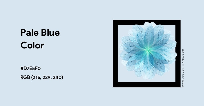
Use blue if you want to play it safe with a highly popular unisex color. Blue is associated with intelligence, security, honesty, loyalty, relaxation, and calmness in color psychology. To add more complexity, use pale blue ink on navy blue, which stands for importance, authority, and power. Cool tones generally represent the sky, sea, and open spaces. However, keep in mind that dark colors tend to be more popular in winter.
White & grey
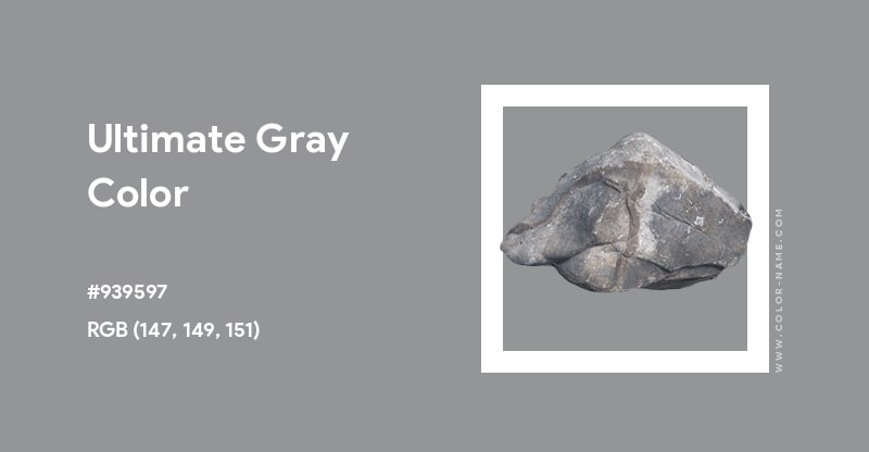
Recommended Sellfy product color combination: shirt Heather Grey & ink #FFFFFF or shirt White & ink #939597.
Conservative yet timeless, white and grey is one of the most classic design combinations ever because it’s neutral and fits almost everything. It’s also a highly featured color combination in the current light academia aesthetic.
White and grey are considered very sophisticated and high-class, which is why Apple uses this combination.
Use white ink on grey (or vice versa) if you want to go for something bright and simple. This color combination is associated with neutrality, practicality, and freedom in color psychology.
Colors like these are especially popular in the summer season because bright tones tend to look best on tanned skin. So, make sure you include this in your summer collection!
Pink & light pink
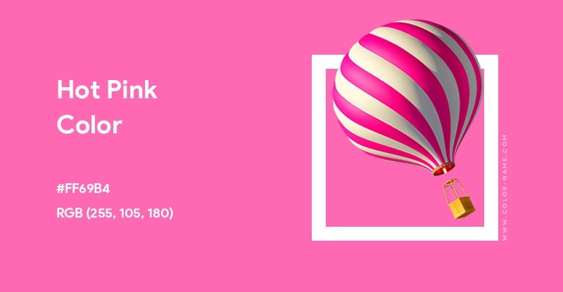
Recommended Sellfy product color combination: shirt Hot Pink & ink #FFF0F5.
I’m sure you’ve heard of millennial pink. It has recently made a comeback with a slight change in shade—from millennial pink to a Y2K bubblegum or hot pink. This transition from a soft blush tone to a more vibrant shade highlights how cyclical monochromatic fashion is.
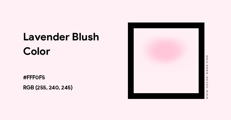
Use light pink ink on a darker shade to make the colors pop and keep up with the trends. This pair of colors showed up on the Fall 2020 runways and has been the go-to color choice for many ever since. This combination is associated with romance, sweetness, and friendliness in color psychology. It’s also associated with Y2K nostalgia and the late 90s. Just like white and grey, this is another bright color scheme that is perfect for summer.
Red & maroon
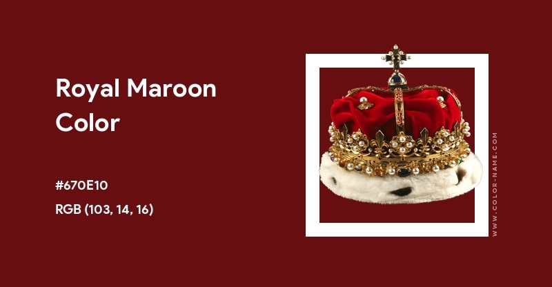
Recommended Sellfy product color combination: shirt Independence Red & ink #FF7F7F.
Red and maroon are some of the oldest used monochromatic color combos in recorded history. A favored color by royalty, red and maroon are bold and make a strong visual impact, which is why brands like Netflix and YouTube use them.
Red tends to evoke a strong response, and maroon is believed to increase energy and adrenaline. Both colors are alluring and stimulate warmth, and make for an awesome shirt design!
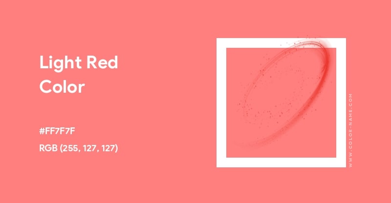
Use these colors if you want a fierce combo that compliments all skin tones. This color scheme is associated with aristocracy, passion, bravery, excitement, and power in color psychology. Maroon ink is also attention-grabbing and creates a sense of urgency. If you want to make a bold statement and call people to take action (ie to buy your shirts)—be sure to use these colors in your shirt design!
Analogous shirt and ink color combinations
Analogous colors are colors that are next to each other on the color wheel. They offer more variation and can make any design look well-composed and visually appealing.
Use analogous colors if you want to achieve a low contrast yet stylish shirt design.
Orange & red
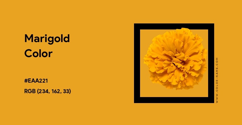
Recommended Sellfy product color combination: shirt Red & ink #EAA221.
Red and orange are the warmest analogous colors—a perfect color combination for a fun and vibrant design. In fact, orange was one of the five biggest color trends of 2021! It was also one of Pantone’s Spring 2021 Colors (called Marigold). According to Pantone, the rich color of orange evokes a cozy and friendly vibe.
Use these colors if you want to create a playful and energetic shirt design. This combination is associated with enthusiasm, adventure, and optimism in color psychology. Orange is also used to create a sense of haste and to seem affordable. Studies have shown that these colors are the best combo for encouraging people to buy a product!
Green & yellow
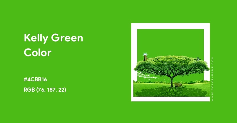
Recommended Sellfy product color combination: shirt Kelly Green & ink #FFCC00.
Green rose to popularity with the influence of the cottagecore aesthetic. Pantone has stated that green relates to nature as it is restorative and regenerative. Mixing earthy green with sunny yellow gives you another bright scheme that will make the colors pop!
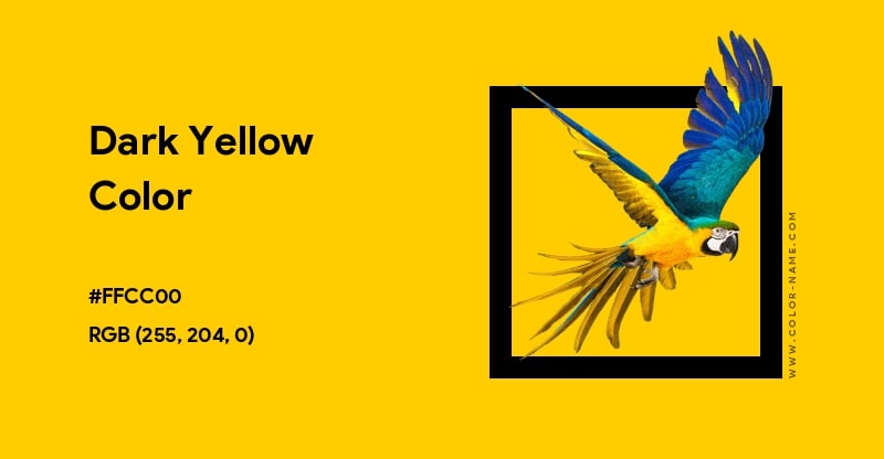
Use yellow ink on green if you want a design that has a little more spark and contrast. Green and yellow are soothing, but also very eye-catching. This design combination is associated with growth, joy, and refreshment in color psychology. Green and yellow work perfectly well for organic brands that promote environmental friendliness.
It’s also a great shirt color combo for outdoor activities like hiking and gardening, which have become increasingly popular during the pandemic.
Purple & blue
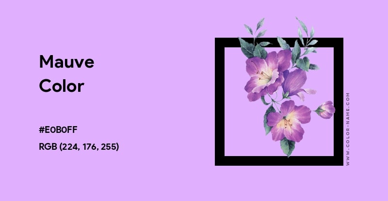
Recommended Sellfy product color combination: shirt Heather Blue & ink #E0B0FF.
Did you know that purple is now the new millennial pink? And that specific hues like mauve, lavender, and lilac are called millennial purple? These shades took over fashion and design in the 2020s. Blue was also Pantone’s Color of the Year in 2020, and together with purple, it’s currently one of the highest trending color combinations. So, you definitely can’t go wrong with this design!
Use this color combo if you want to blend the world’s most beloved unisex color (blue) with ink that signifies royalty (purple). These cool tones are associated with luxury, sophistication, and mystery in color psychology. Purple tends to be used with high-end products and can bring a magical and soft element to your custom shirt design.
Complementary shirt and ink color combinations
These are colors that are opposite each other on the color wheel. In other words, opposites attract! When matched together, opposite combinations create the strongest contrast for screen-printed shirts. So, if you’re not into low-contrast color schemes like analogous or monochromatic, then complementary is your next best design choice.
Use opposite colors if you want high-contrast and bright designs that really stand out.
Green & red
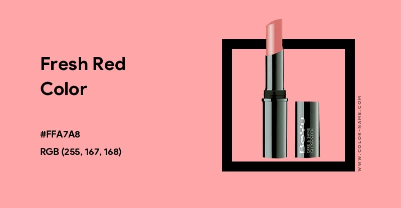
Recommended Sellfy product color combination: shirt Heather Green & ink #FFA7A8.
Red and green are typically associated with holidays like Christmas. Since this color combination is usually featured in winter fashion collections, it may not be the best idea to use it for your summer designs. But, you can still make it work if you use red with olive green or dark green with a lighter shade of red. It’s all about picking the right shades!
A tee design with these colors is best suited for something festive or wintery. But, depending on the shades, it can also work for summer (for example, olive green is typically used for safari clothing). It’s also great for attracting immediate attention and evoking a sense of growth and confidence. The calmness of green helps tone down the intensity of red.
Purple & yellow
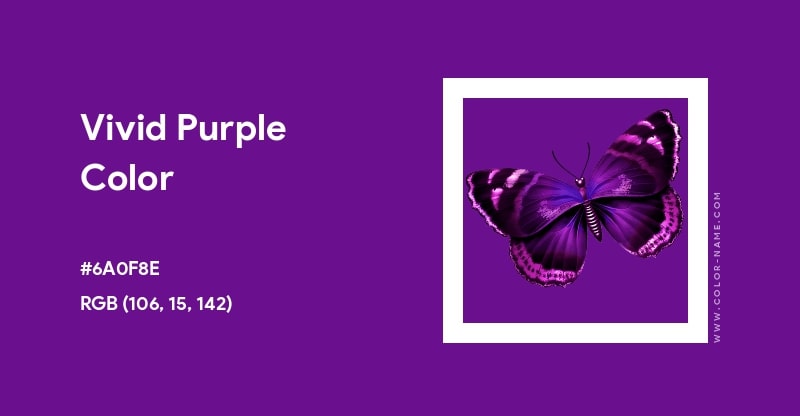
Recommended Sellfy product color combination: shirt Spring Yellow & ink #6A0F8E.
Yellow and purple are some of the most distinctive color combinations. When you blend a luxurious purple with a joyful tone like yellow, you get a very stylish and chic tee design that anybody can wear. It’s also considered a classic color scheme for royal fashion and interior design.
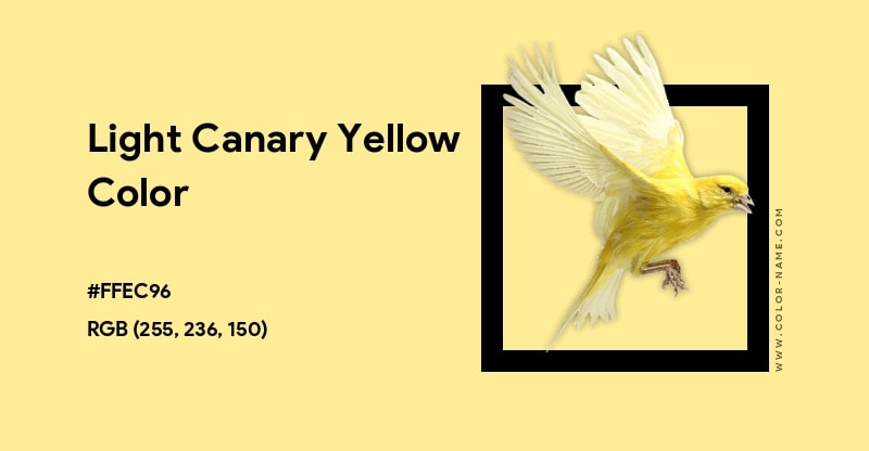
Use yellow ink on purple if you want something unusual. This color combination is associated with exclusivity, exoticism, and mysticism in color psychology. It also gives off vintage vibes as this has been a highly popular pair for centuries.
Black & white
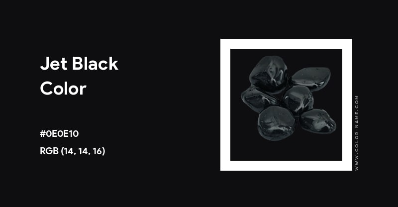
Recommended Sellfy product color combination: shirt White & ink #000000 or shirt Black & ink #FFFFFF.
Black and white is almost a no-brainer pick for a custom shirt design! It’s such a universal color that it’s almost 99% guaranteed that anybody will wear it. It’s also a safe choice because black and white are both neutral colors. This color combination can come off as either edgy and grunge or classy and powerful depending on the design.
Use white ink on black (or vice versa) if you want a neutral and safe color palette for your shirt. Mixing black and white together can create a polished and well-put-together look. In color psychology, it’s associated with power and refinement, making it a fool-proof classic for a shirt.
Black also evokes sophistication and authority while white communicates innocence or purity. What’s awesome about this color combo is that it can work well together on all skin tones!
Blue & gold
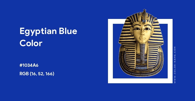
Recommended Sellfy product color combination: shirt Royal Blue & ink #CFB840.
For the ancient Egyptians, gold and blue were one of the most important color combinations. Blue was associated with the universe while gold symbolized divinity. Sounds pretty badass, doesn’t it? This color combination is also used in modern-day fashion and royal interior design to represent prosperity and elegance.
Use gold ink on blue if you want to achieve a nice balance of warm and cool tones. This shirt and ink color combo can work incredibly well on tanned skin, making it a potential hit for summer. These colors are also associated with luxury, and many brands tend to use them to create a glam look.
Have fun with shirt color combinations!
Now that you know what ink colors go well together on a shirt, you can have fun with the color palette and create printed designs that actually work. For more related articles in our blog, I suggest 21 trending shirt designs in 2025. And, remember, if you’re using Sellfy’s print-on-demand services to sell shirts, you can go beyond that and also create your own merch. Good luck!


