Creator Spotlight: Timo & Jeff from Regular Bold Italic

So pleased to have graphic designers Timo Kuilder and Jeff Schreiber from Regular Bold Italic with us this week. Prepare for some catching up on the typeface creation topic, as you’ll learn quite a few new words. I made it easy for you to follow our conversation without dictionary by including a few definitions here and there.
How did the Regular Bold Italic (RBI) came to be? Why did you decide to partner up?
The first typeface I made was Bigmouth back in 2009, mainly out of curiosity. It’s pretty magic to type in your own font. Jeff Schreiber did his internship at the studio I was working for as a freelance designer. He also began making typefaces and immediately started kicking my ass. So I had to step up my game. This is the good thing about collaborating, you can inspire each other and it’s just more fun than doing stuff alone.
We started RBI mainly because we like to draw letters. It’s true that we didn’t spend years and years creating the new DIN or a twenty four-folded Helvetica. Our perfection lies in exciting shapes and fonts with character. Every time I make a logotype I have to control myself not to make a whole alphabet out of it.
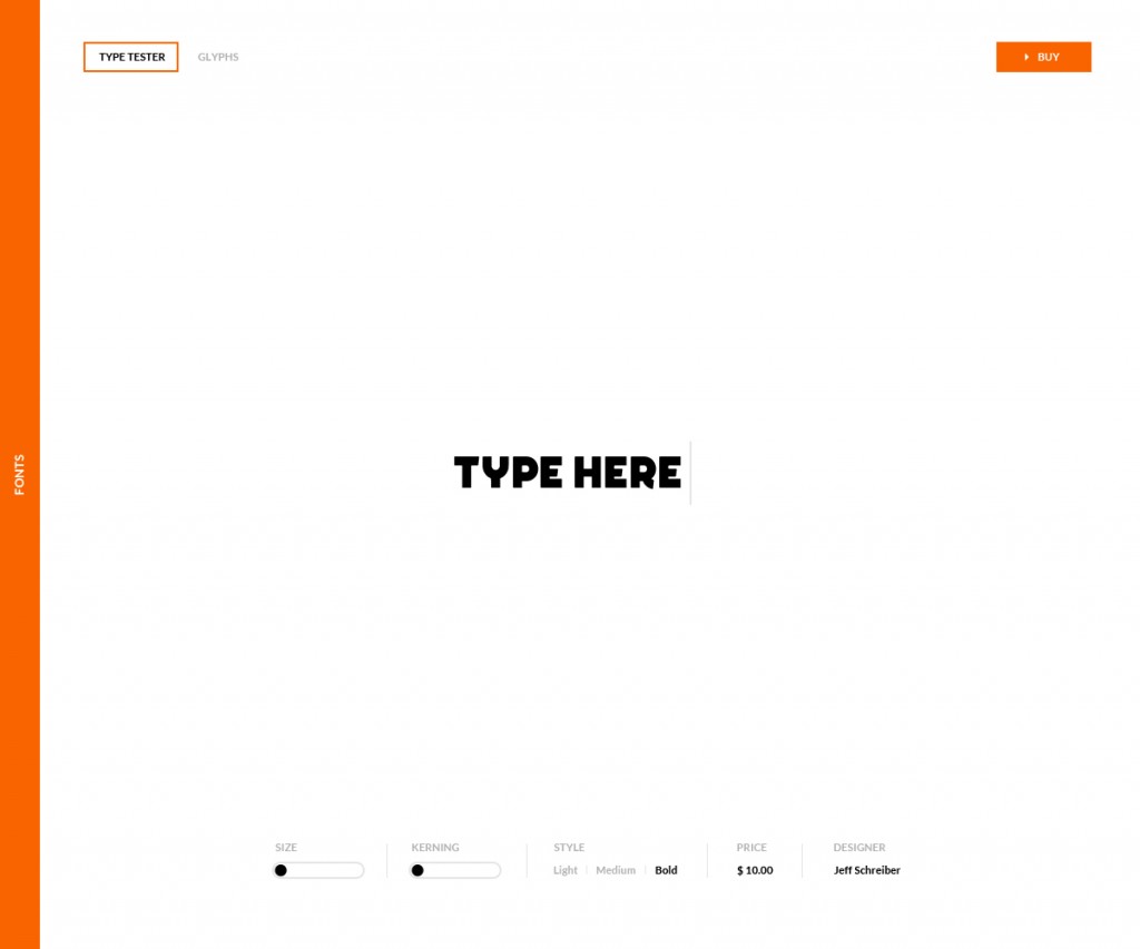
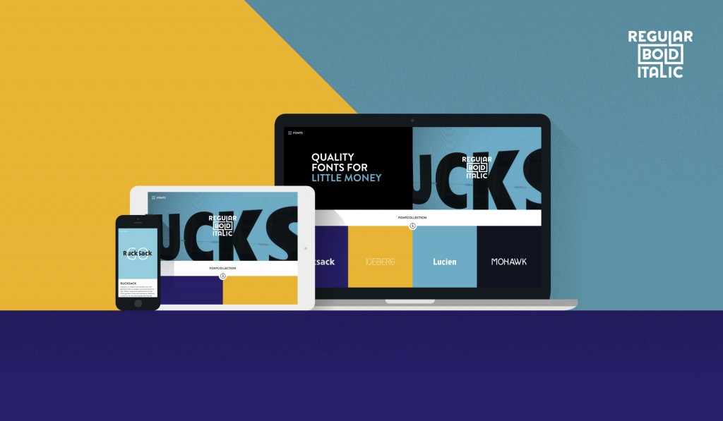
Our first website was pretty minimal, just one big typetester. Which I still like, but we have a lot to learn concerning webfonts. Showing them only and directly in the browser was not the best way to present our fonts. We have some reading up to do about font hinting for web (Ed. note: Hinting, or screen optimising, is the process by which TrueType or PostScript fonts are adjusted for maximum readability on computer monitors) and maybe even making a solution where we also host them.
Tell us a bit more about your latest product – Barbour.
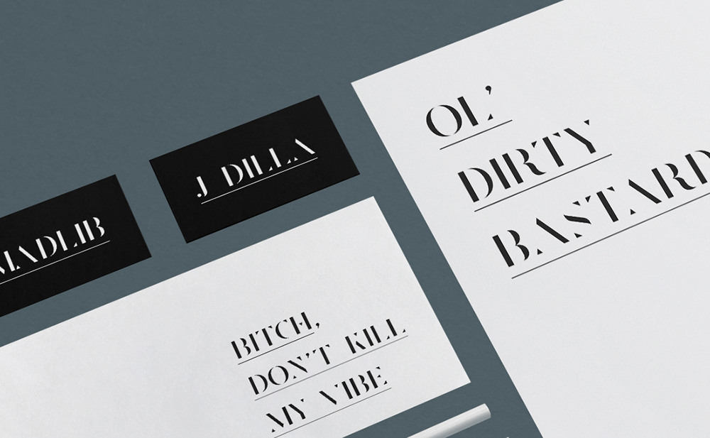
It’s a classy & elegant stencil serif with high contrasts. Barbour is designed to be used for editorial purposes such as magazines, posters and covers. You could call it a typical display face. The cut out letters in it’s specimen PDF (Ed. note: a type specimen is a publication in which a typeface is shown and presented, detailing what fonts the typeface consists of) are not set in the typical pangram (Ed. note: hi, it’s me again. in case you forgot, pangram is a sentence that uses all the letters of the alphabet at least once. Ok, bye!) ‘the quick brown fox jumps over the lazy dog’ but instead uses hiphop references.
That’s cool, and how do you actually promote your products?
Lately we’ve been trying to build an audience before releasing the font. This means shouting about it on Twitter, Facebook and Instagram. Posting some stuff on Dribbble and Behance. Our fonts are getting picked up by blogs, so that certainly helps. Bothering people who run blogs is another promotion technique that we certainly don’t use enough. We also get a lot of hits through our free samples.
How have you built your audience and online presence?
Mainly by offering fonts for free. We think it’s important you can try a font in your designs, whatever tool you’re using. So just a typetester won’t do it. That’s why we offer a free sample of all our fonts. You need a test drive before you will buy a font, don’t you? And we try to keep them affordable. As a designer you shouldn’t have to bother your client about a different license if he wants to use it in his app.
What’s the best feedback you received about your products?
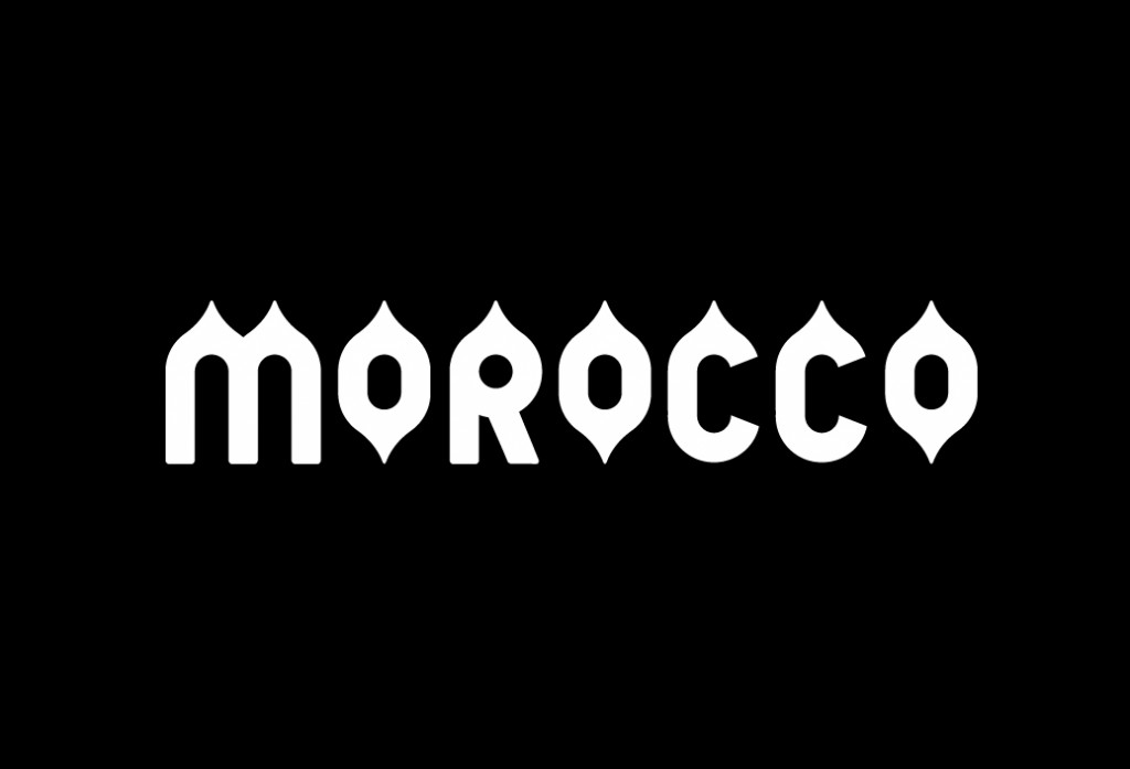
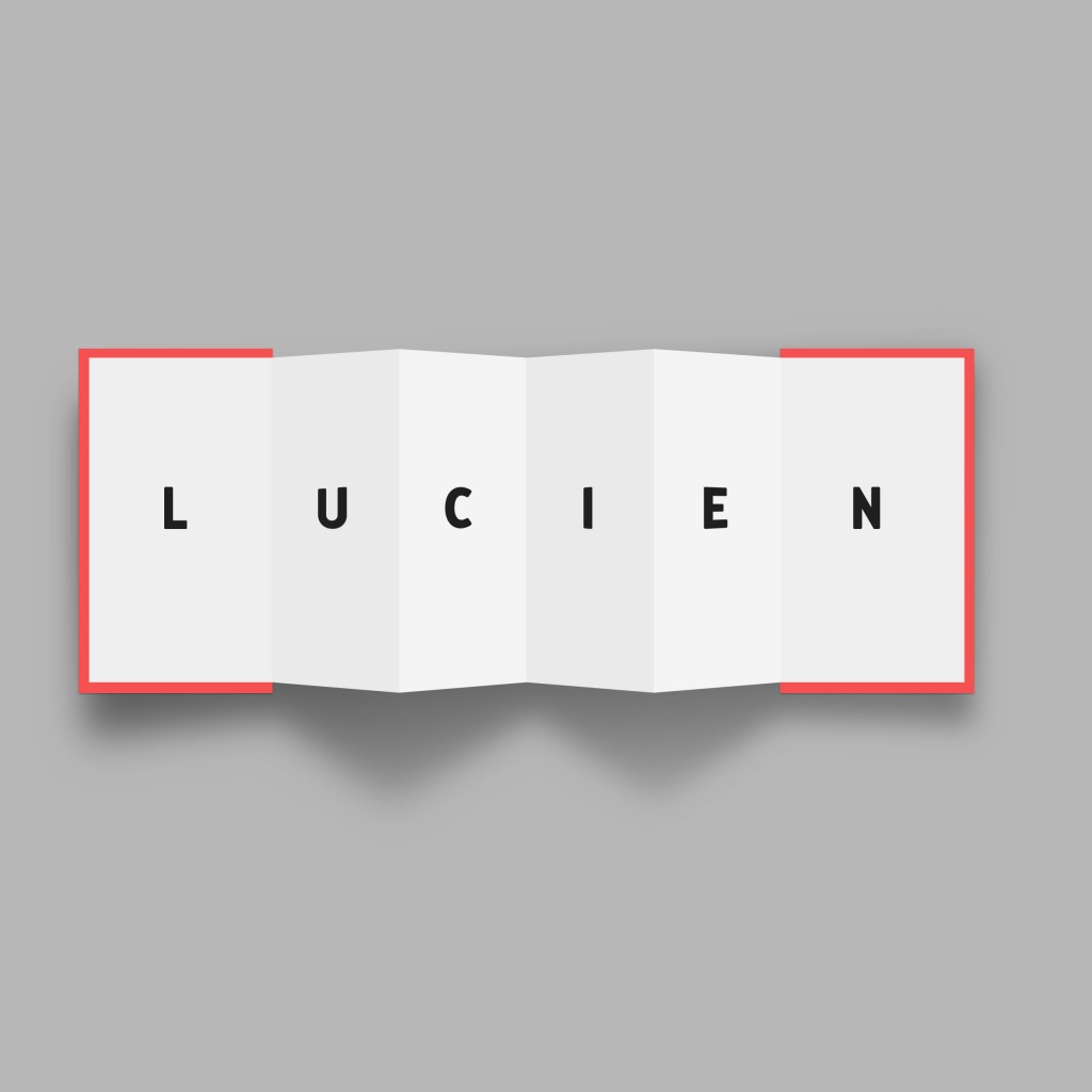
The best feedback is to see our fonts in use, especially if they are well designed. So to all the designers out there, if you use them, please show us! Then we can also showcase them on our platform. But it’s also fun to unexpectedly bump into a design which uses our fonts.
Any advice to designers out there just starting out?
Not really. It’s good to make mistakes. Suck it up, learn from it. We also sort of fell into this. Like many of us, I think. I’m actually pretty ashamed for some of the typefaces we still have online, because every time they become a tiny bit better. In the beginning we had no idea what we were doing (and still not really haha). But just because some of those fonts still keep getting us a lot of traffic, we keep them up for now. But slowly we will start killing them, I guess.
Can you share any low-profile website where you get inspiration for your work?
Recently discovered this tumblr, which has some very good stuff.
What advice would you give a younger you?
Don’t do it. Making fonts takes massive amounts of time 😉
What should we expect next from you?
We just became part of the @highontype family – a group of type enthusiasts who organise calligraphy workshops, hold lectures and maybe will even host a type festival in the future. 11th of December is their latest talk in Den Bosch (the Netherlands) with Hansje van Halem, Janno Hahn and Gwer, who will show how to vectorise the letters the proper way. Come check it out if you’re in the neighbourhood.
We’re very excited about joining them, because they all are making killer work. We’ll be giving some typography workshops and explain how to build your own font with the Glyphsapp.
P.S. Check out their store on Sellfy!


