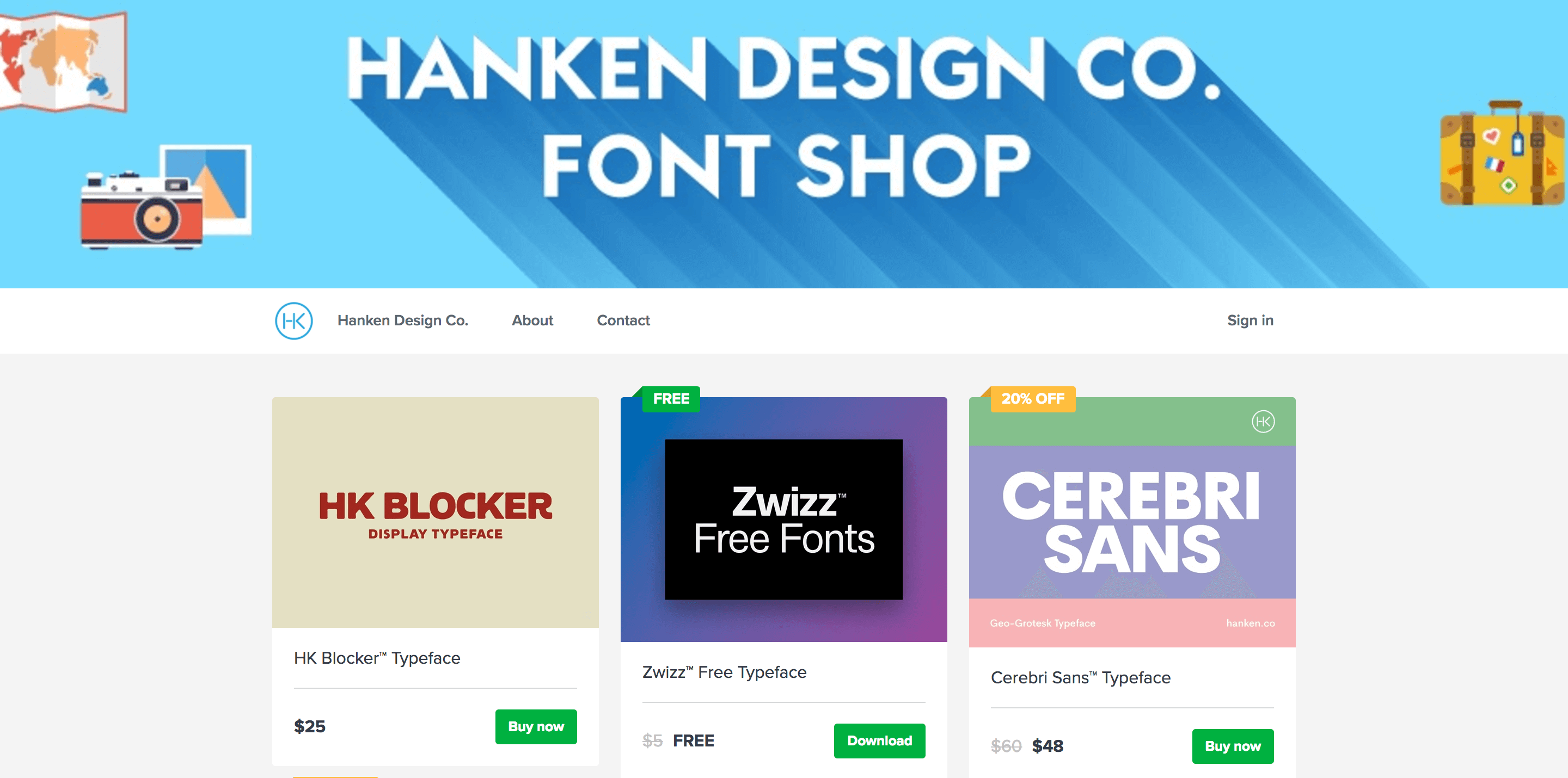
New Layout for Your Sellfy Store
Have you already noticed anything different about your store? We’ve just rolled out an update to how your store looks and feels, switching the focus from Sellfy to your brand.
You’ll notice that we’ve almost completely removed Sellfy branding from your store and product pages, leaving just a small powered by Sellfy block in the footer. Want to learn about all the changes we made? Read below.
First, why are we making these changes?
We are updating your store layout to make it more about you and your brand. Before this, your store was just a profile on Sellfy marketplace. Now we’re aiming at making every store an independent entity with its own powerful brand.
We’ll be rolling out more customization options in the coming months, so you’ll be able to match the branding on your website, social media and your store.
What changes for your store?
You’ll see quite a lot of changes for your store and the way it looks. This is the list of the top 3 biggest changes:
**#1. Your brand comes first. **
All your store, product and download pages have the same branded header now. This helps guide your customers through the whole process, making them feel more comfortable that everything is going as planned. There are no sudden changes in the design that could make them feel unsecure about purchasing from you. It will also prevent any confusion from buyers as to WHO is the creator they’re buying from.

#2. Cleaner, modern look.
Designed to make your store look good on all devices. Your store will now give the impression that it was designed for the year 2017.
#3. Store visual customization (coming soon).
Following this layout update, PRO users will receive access to our store customization tool, with more controls over the color, feel and look of your store.
On top of that, we’re also releasing some smaller changes, that you’ll find useful:
Separate about page. Your store will have a separate about page from now on. At first, we’ll limit it to text only with up to 1,000 characters, but later you’ll get a WYSIWYG editor (see below).
Replaced “Follow” button with “Subscribe”. Customers and store visitors will be able to subscribe to updates from you and your store. A prominent block asking to subscribe will be displayed in the footer of your store.
![]()
More social icons (coming soon). Previously, you only could list 3 links in your profile page – Twitter, Facebook and one custom URL. Soon you’ll be able to list many more social icons, including YouTube, Instagram and more.
WYSIWYG about page (coming soon). You’ll be able to describe your store in as many details as you want and even complete it with pictures and testimonials.
How can you start using the new layout?
Your store will be updated automatically, you don’t have to do anything to switch from old version to new.
Over to you
Do you like your new updated store? Is there anything you think we should change or add? Let us know in the comments section below!


