Create an online store for your spreadsheets
See how
Step-by-step guide to formatting a spreadsheet
If you’re ready to create a well-formatted and professional-looking spreadsheet template to sell online, here are the key steps you need to follow:
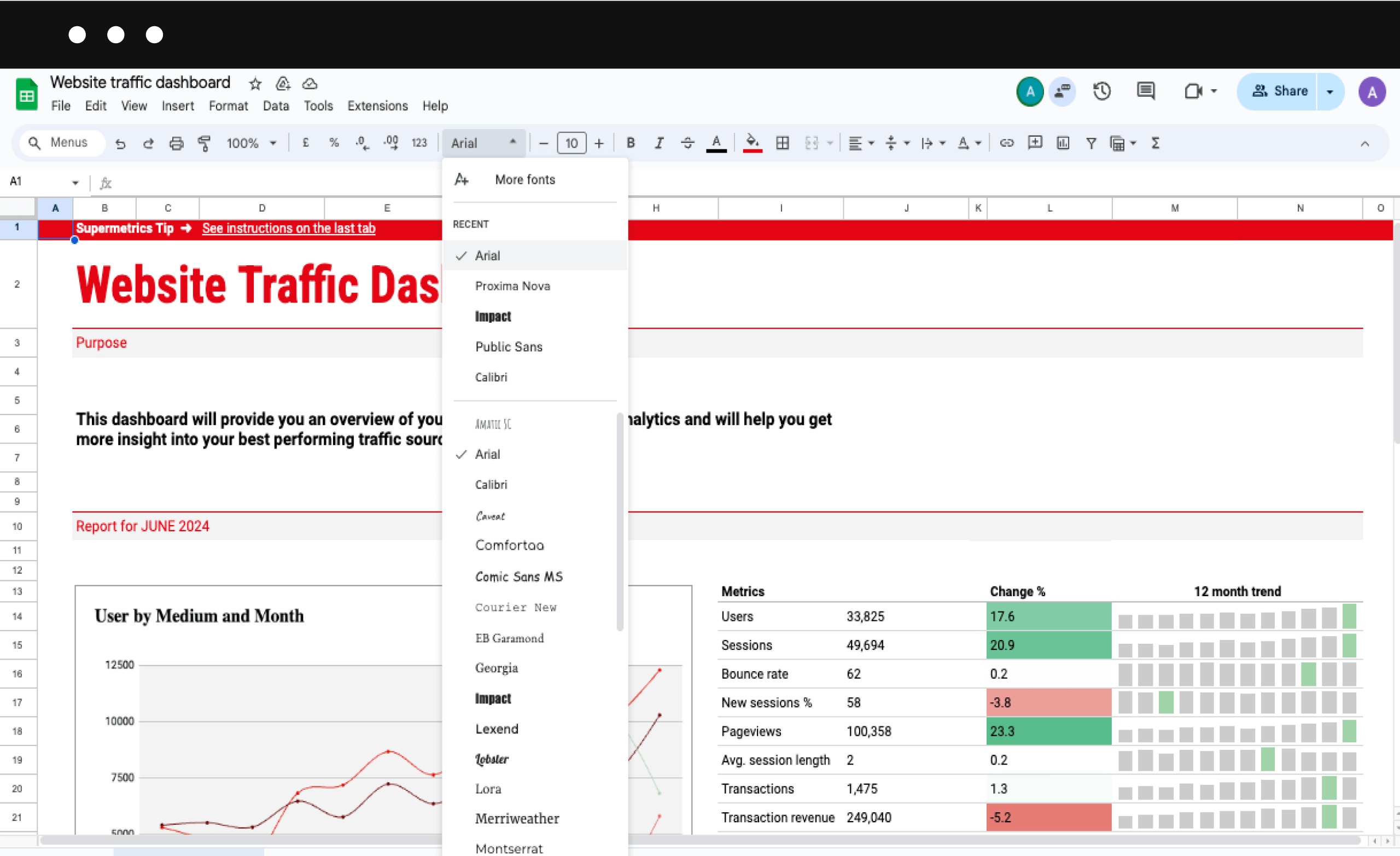
1. Choose a consistent font
Consistency is key in all aspects of professional life, especially in visual aspects such as creating spreadsheets. Make sure to select a clean, professional font that’s easy to read and stick to it.
While you can vary your fonts a little if needed, try to stick to one or two fonts throughout your entire spreadsheet.
Some professional-looking fonts we recommended include:

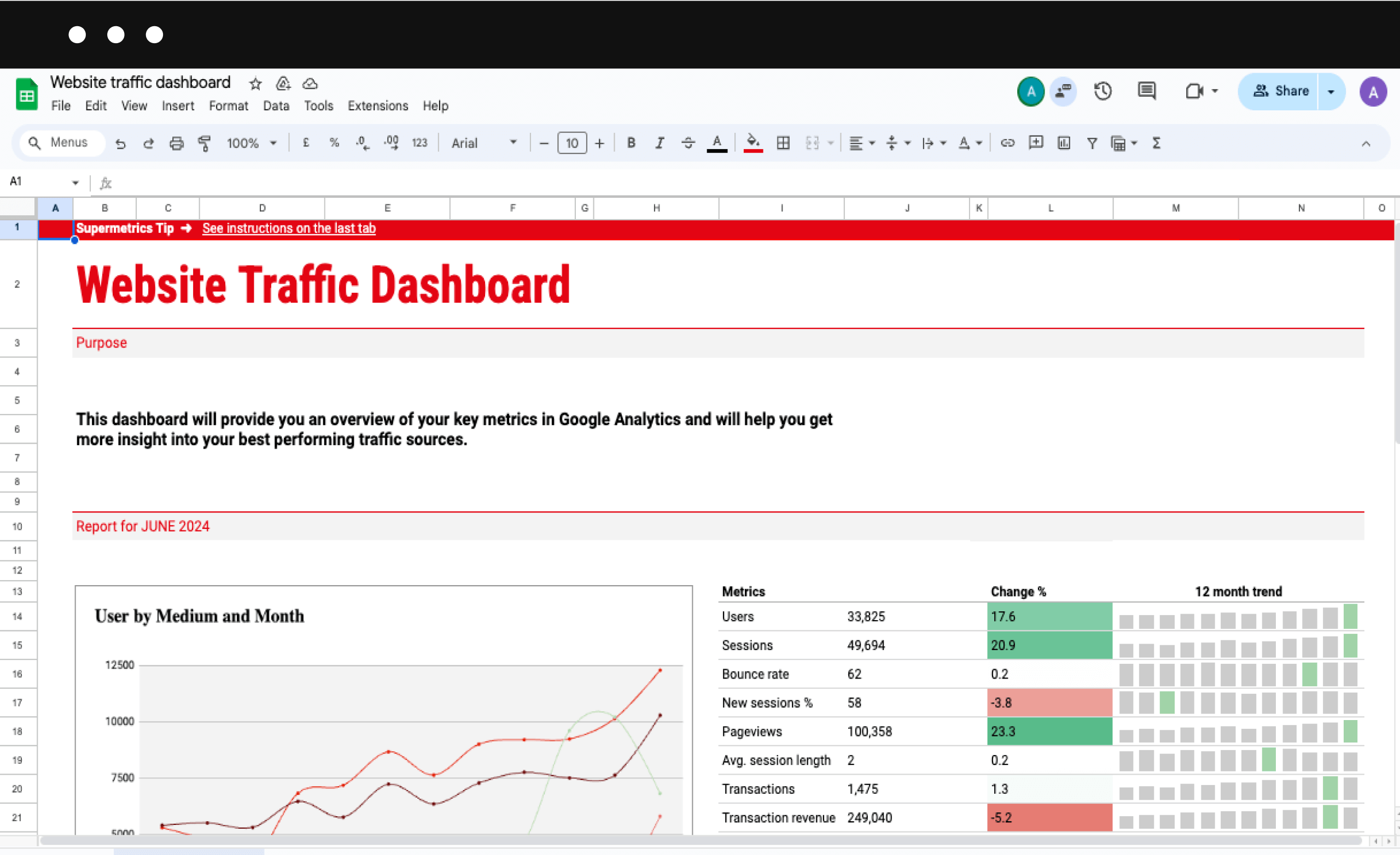
2. Make sure to use appropriate font sizes
Just like fonts, you’ll want to have a consistent use of font sizes – but in this case, this entails establishing a clear hierarchy of font sizes for different types of text.
This means having a standard size for body text, slightly larger for subheaders, and the largest size for main headers. Here’s an option you could go with:
- Main headers: 14-16pt
- Subheaders: 12-14pt
- Body text: 10-12pt
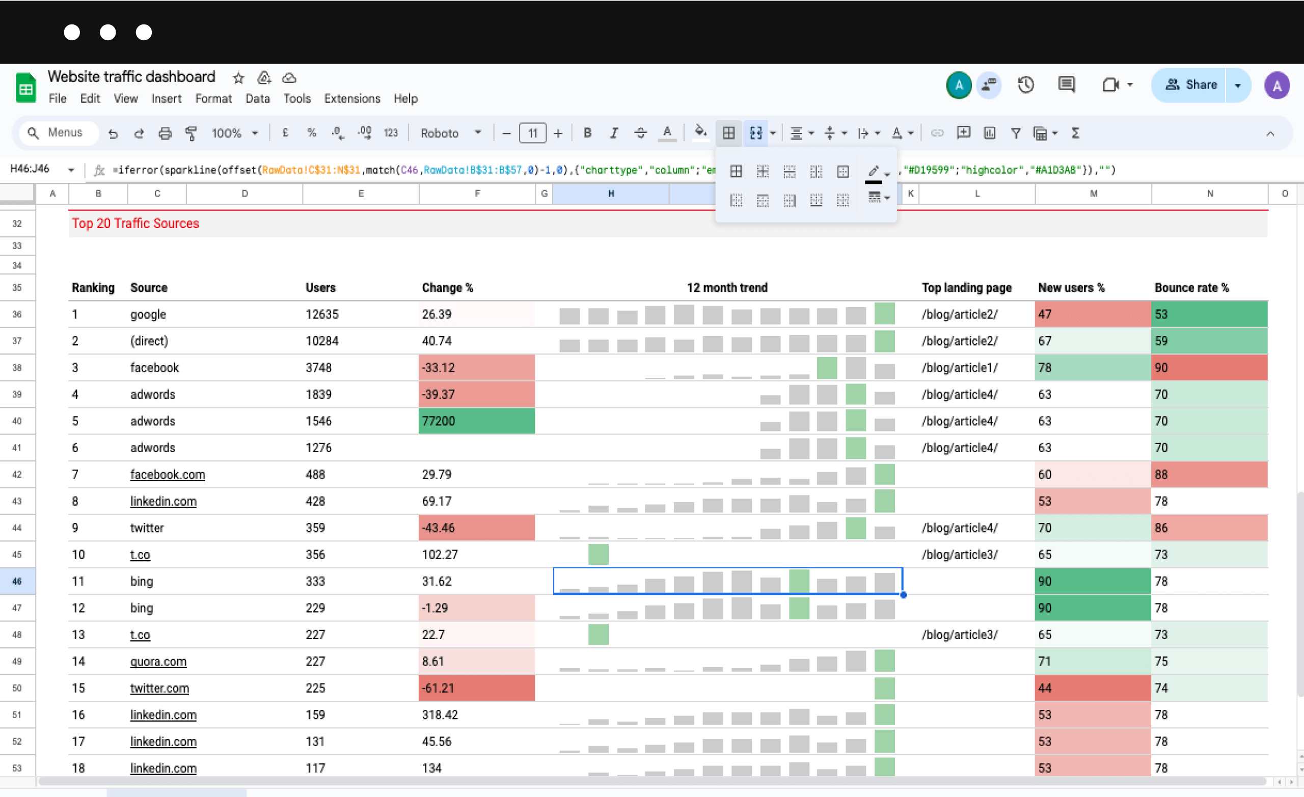
3. Apply cell formatting
One of the central elements of professional formatting is aligning everything in your spreadsheet template appropriately.
This should include left-aligned text, right-aligned numbers, and center-aligned headers.
In addition, make sure to merge cells for main headers to create a clean, organized look and “Wrap Text” for longer descriptions to ensure they are easily readable.
Many spreadsheet creators forget to leave “Row 1” and “Column A” empty. This creates a visual buffer and helps make everything look more separated and professional.

4. Freeze panes for easy navigation
Most popular spreadsheet software allows you to freeze panes, so use it!
Freeze the top row and/or first column to keep important information visible as users scroll through large datasets. This is particularly useful for spreadsheets with extensive data entries.
5. Remove unnecessary borders and colors
Too many borders can clutter up the screen, so try to use borders sparingly to separate distinct sections.
Instead of borders, you can apply subtle shading (no bright colors!) to differentiate headers and essential data.
For your entire spreadsheet template, select a professional color palette (2-3 colors max) that complements your design without overwhelming the data.

6. Format headers and subheaders
Make sure you have consistent formatting for all headers throughout your spreadsheet and that each one gives a short, clear outline for the relevant section or column.
For example, you may decide that all your headers are bold, have a slightly larger font, and use a light background color.
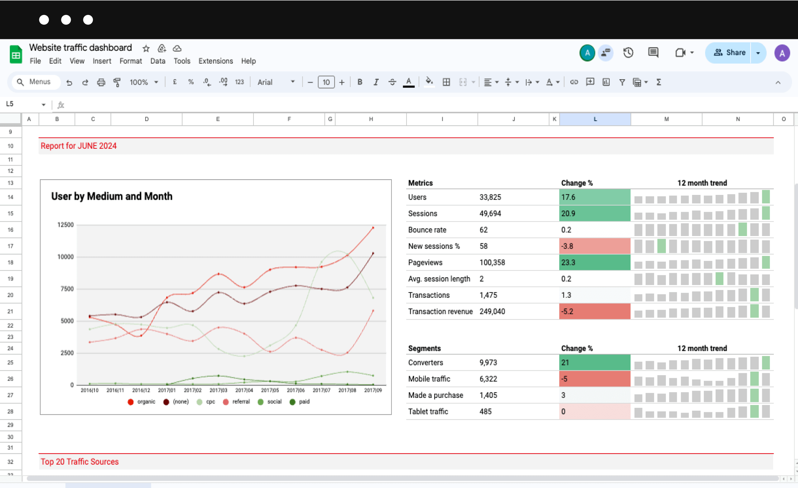
7. Use charts and graphs
When used correctly, charts and graphs are a great way of condensing vast data sets into easy-to-digest and understandable graphics.
Where appropriate, include visual representations of your data in the form of bar charts (for comparing quantities), line graphs (for visualizing trends over time), and pie charts (for showing percentages/proportions of a whole.)

8. Implement Consistent Number Formatting
Spreadsheets are the home of data, and there’s almost sure to be a variety of different types of numbers that populate your spreadsheet template.
To keep things organized, clean, and professional, you must keep a consistent number formatting. This means:
- For currencies, always use appropriate symbols and decimal places, such as “$1,234.56”.
- Display percentages with consistent decimal places. For example: “25.5%”.
- Choose a clear, unambiguous date format, such as DD/MM/YYYY or MM/DD/YYYY, and stick to it throughout your spreadsheet template.
9. Use Conditional Formatting
If used carefully, adding color to your spreadsheet template can help quickly draw the user’s eye to critical data — something that conditional formatting is perfect for.
This feature allows you to create cells that visualize different colors depending on the input data.
Create an online store for your spreadsheets
See how
Conditional formatting is perfect for drawing the user’s attention towards outliers in data sets or to easily and quickly indicate a spread of values. You can use:
- Color scales to show value distributions
- Data bars to visualize relative values
- Icon sets to indicate performance levels
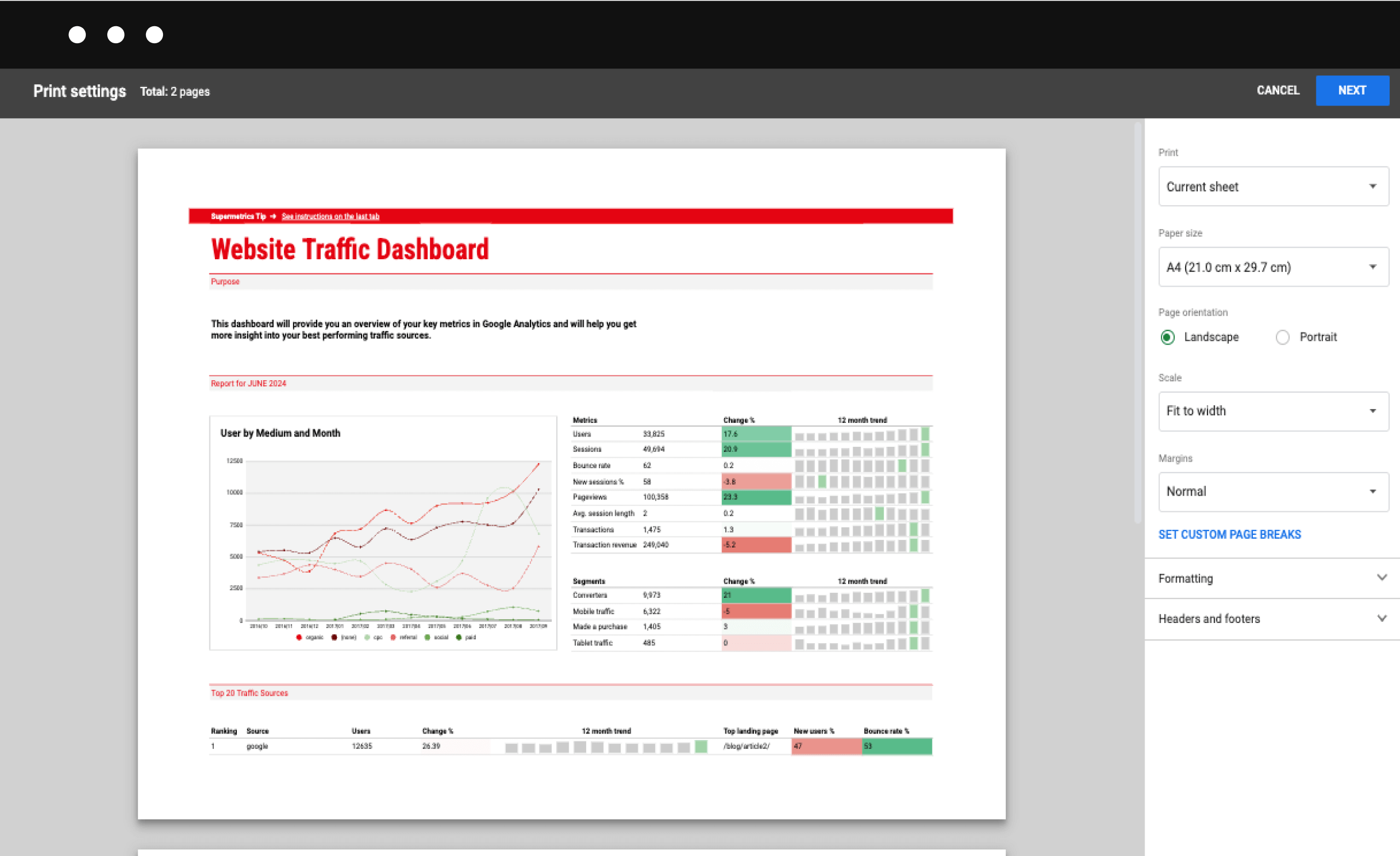
10. Optimize for print
Unlike many other document types, spreadsheets are not automatically in the correct format for printing, which is why it’s vital you format this yourself before trying to sell templates online via sites like Sellfy.
Make sure the print area only includes relevant data, and adjust the page layout (i.e., the margins, orientation) for optimal printing.
It’s also worth adding headers and footers with page numbers and other relevant information to make navigating the printed document easier.

11. Proofread and review
The last thing you want in a spreadsheet template you plan to sell to customers is basic spelling and grammatical errors, which is why proofreading is an essential final check before selling.
Before you’re ready to price and sell your spreadsheets online, you need to:
- Verify all formulas and calculations work correctly.
- Ensure consistent formatting throughout.
- Ask colleagues, friends, or beta testers to review and provide feedback.
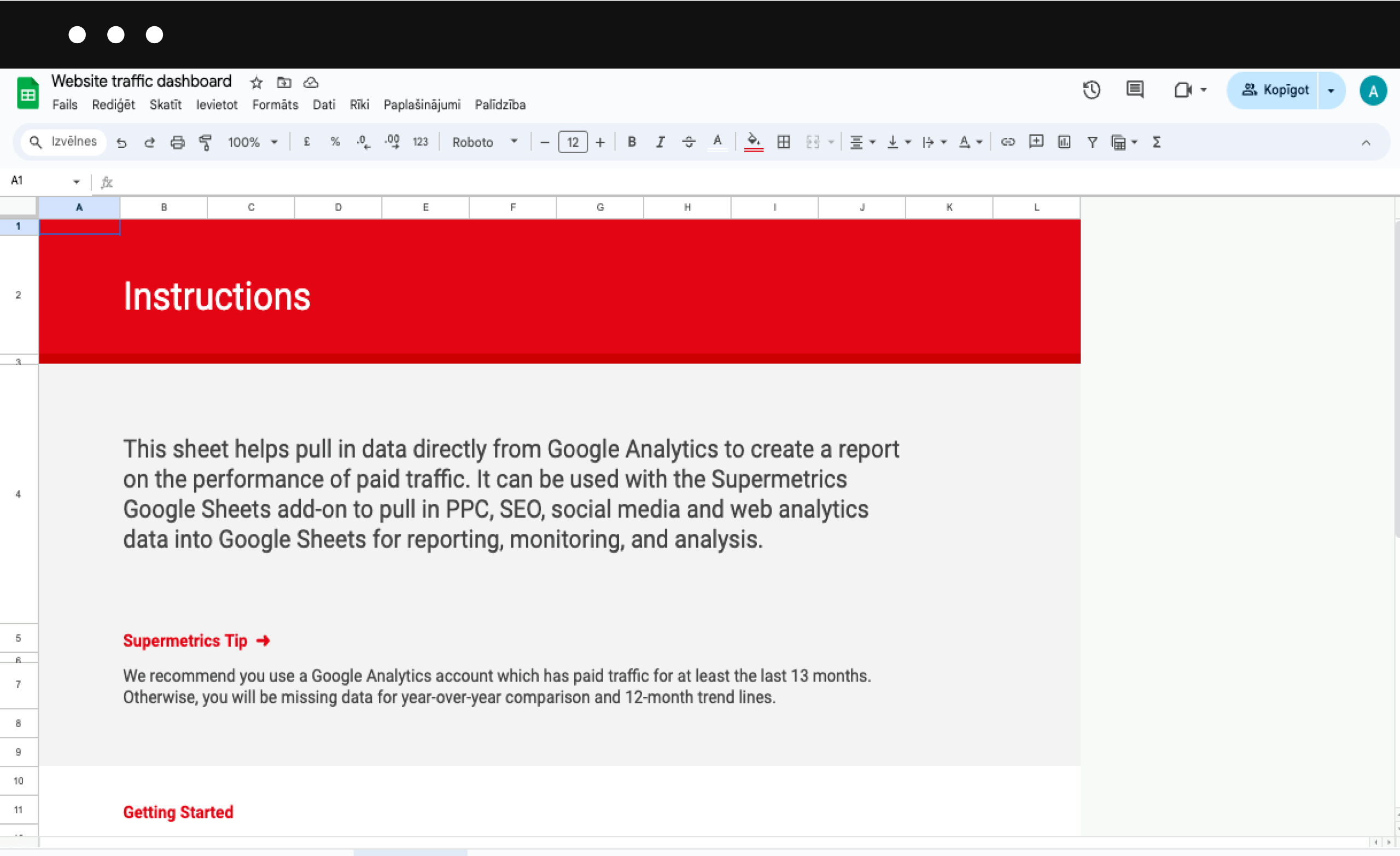
12. Organize worksheets and consider adding a “How to Use” section
Lots of spreadsheets will have more than one worksheet, which is why it’s crucial you make your template as easy to navigate as possible.
This means arranging your worksheets in a logical order and always using clear, descriptive names for each.
If your spreadsheet template is especially complex, consider creating a dedicated “How to Use” sheet as the first sheet that opens, filling it with step-by-step instructions, explanations of key features, and tips for customization to help customers get to grips with your template.

Additional tips for professional spreadsheet formatting
You’ll want to adhere to a few basic rules, such as keeping everything consistent, from color schemes to fonts, and keeping everything simple and easy to view design-wise.
But there are a few other things that can put your template above the rest when it comes time to sell:
- Accessibility: To enable even more people to use your template effectively, try using color-blind-friendly palettes and including alt text for charts and images.
- Protection: Prevent accidental changes (especially to formulas or key data) by using cell and sheet protection features.
- Regular Updates: Keep your template relevant and fresh with consistent updates and customer support.
- Branding: Establish your unique brand and reputation by subtly incorporating your brand elements such as a logo or brand colors. Be careful with this one – make sure not to compromise your template’s functionality while adding branding.
Create an online store for your spreadsheets
See how
What next for your spreadsheet template?
Even after you’ve created your initial spreadsheet template, there are plenty of steps left to ensure a polished, ready-for-sale product.
By following these guidelines, you can guarantee that all your spreadsheet templates are as good as they can be, creating products that are easy to follow, aesthetically pleasing, and, most importantly, useful for customers.
Aleksey is a Content Marketing Specialist at Sellfy. He loves using language and the power of words to make even the driest eCommerce topics fascinating. Using his degree in literary studies and passion for the latest trends, he creates well-researched and structured content to inspire other people and help them grow their eCommerce business.


