9 Tips on Creating an Effective Graphic Design Portfolio
Potential client will probably make up his mind about hiring you within the first half-dozen items of your graphic design portfolio. Thus your first order of business is to make sure that you show your best work at the very beginning. If it is buried deep inside your portfolio, the employer will inevitably have questions about your own understanding of the work.
Read on to find out 8 more easy to implement high output tips on creating an effective online portfolio.
## Don’t show work in isolation
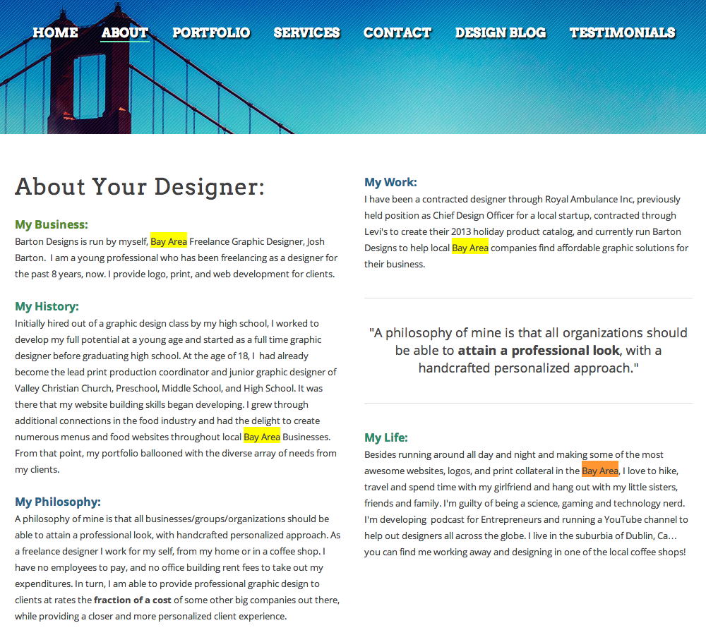
Explain who was the client, what was the problem they were trying to solve. Keep it short, but give some details so that potential client can appreciate your work not only on aesthetic level, but on a practical project level too. Cover what was your role, did you do everything end-to-end or did you go outside your area of speciality. Design exists in some kind of context, so provide your potential client with this context, or risk losing out.
Choose carefully which work to show
If your client comes from corporate or government environment, no matter how creative your arty or grungy work is, it won’t land you the job. Your potential employer is looking for someone who can work within their existing team and culture.
Make sure that the items in your portfolio demonstrate your skill in the area you’d like to be hired in. And it goes without saying that you should only display your best work.
Educate your leads
Some of your potential clients are really unsure of what kind of work they need. What they do know is that they have to have a website. Your best bet here is to explain what you can do.
Educate them about the services you provide and how their business could benefit from that. Explain your portfolio items and how it helped your previous clients with their needs. Tell stories your potential clients want to hear.
Include social proof
Treat your homepage as a landing page, include social proof, such as testimonials from previous clients, or just drop the names of the companies you have worked with.
A word of warning though: don’t just write the testimonials yourself. Save yourself the embarrassment, it’s easy to spot that kind of lie. Make sure it’s genuine and authentic praise from previous clients.
Be professional
Make sure every link works, copy is well-thought out and there are no spelling mistakes. A portfolio that has validation errors also might leave the wrong impression on your leads, so make sure you use valid code.
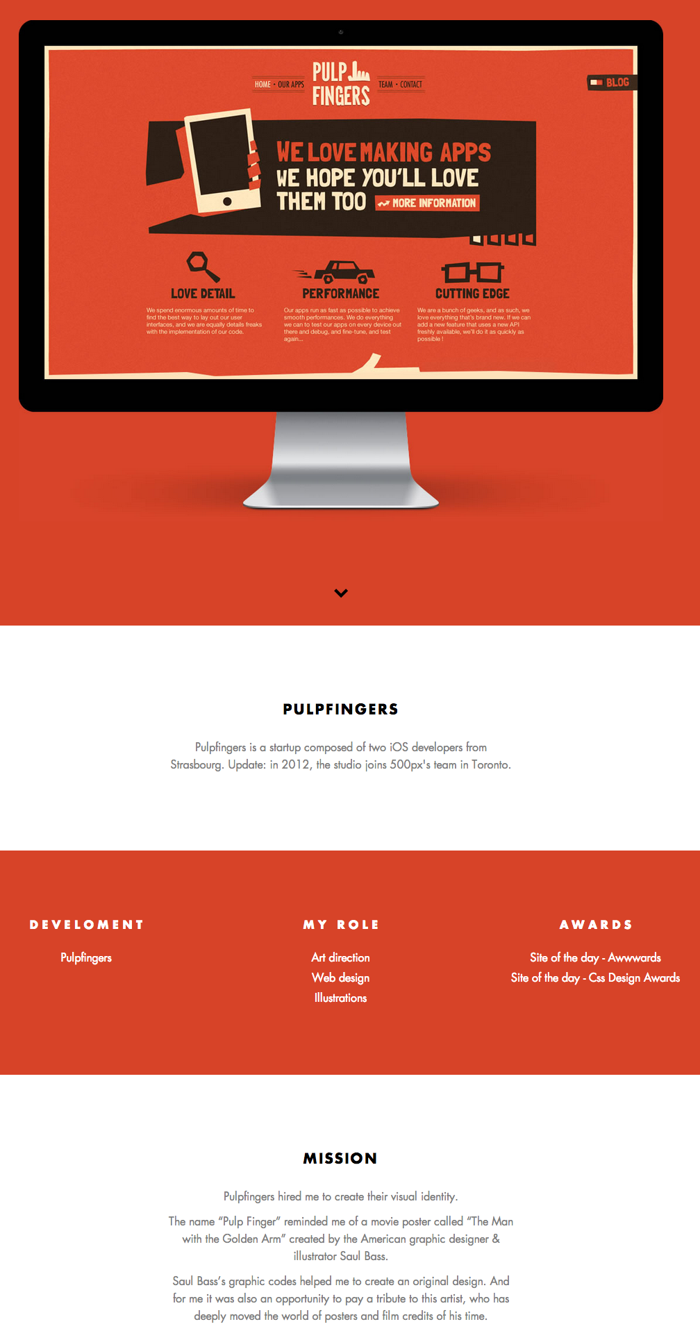
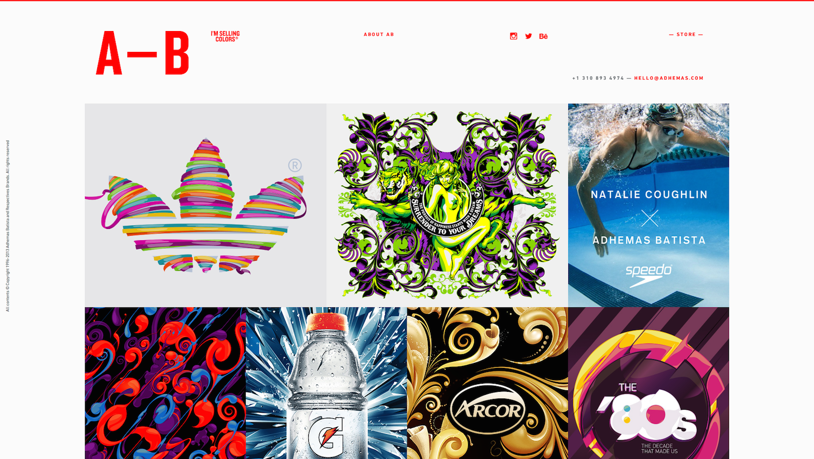
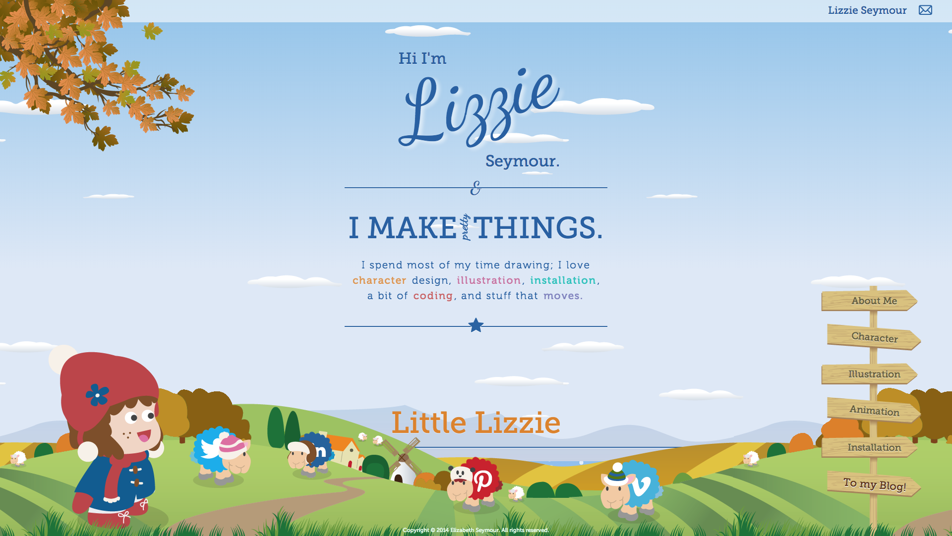
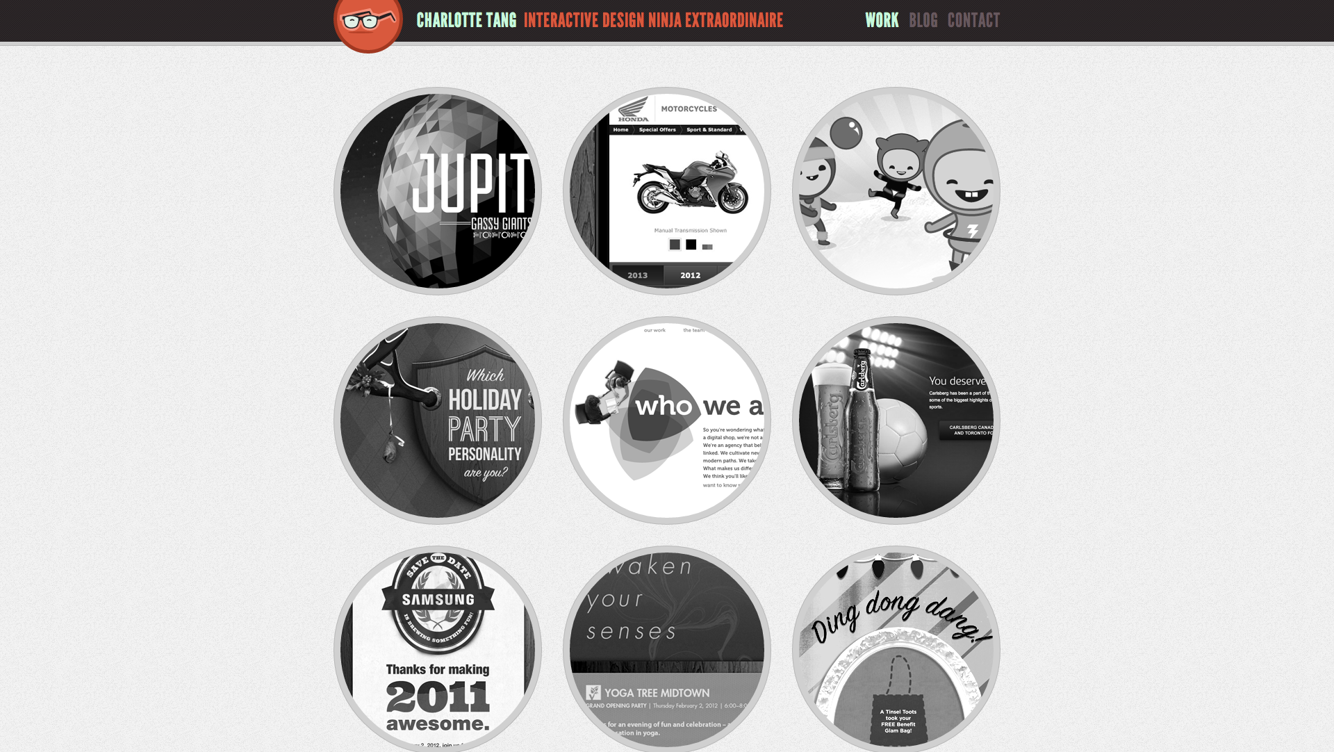
Your portfolio should be fast, easily accessible and simple. Show your creativity in work you display in your portfolio, not on the portfolio website itself. All the work previews should be large enough and obviously include links to the websites.
Little bit of SEO
If you’re looking for clients from specific area, like your place of residence, make sure to include something like “yourcity web designer”. If there’s a lot of competition in your town, don’t expect to be displayed on the first place of the Google search results.
Still, it’s a useful exercise, that can help you land leads in the long-term.
Make it easy to contact you
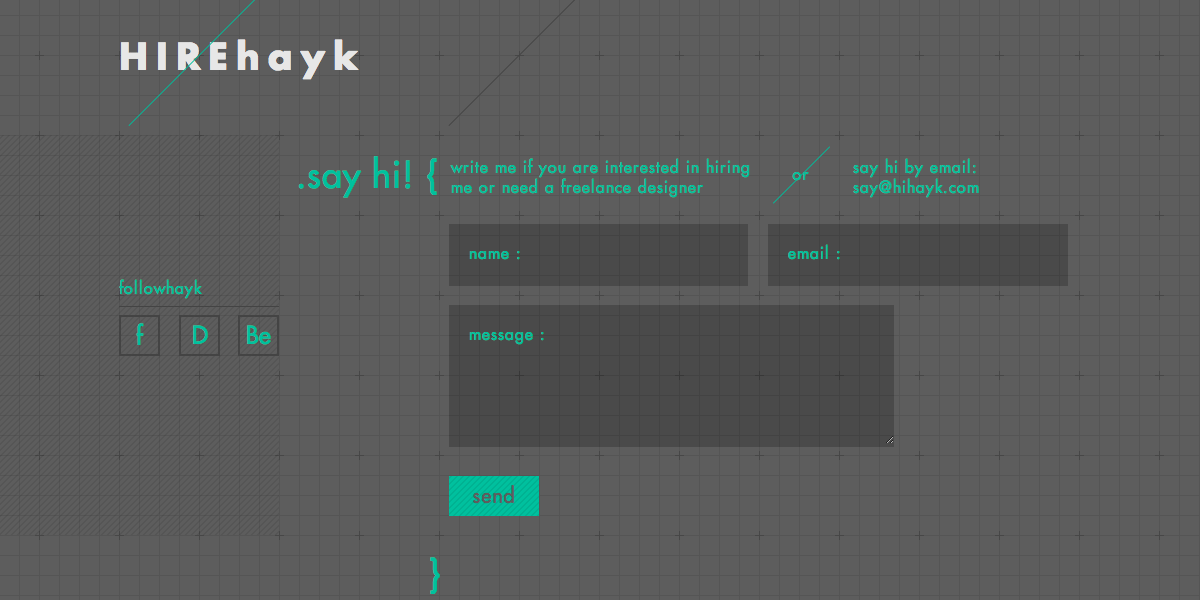
Include a contact form and a plain text email address before anything else. Explain what kind of information potential clients need to provide to get the fastest response.
Include social networking profiles only if they’re professional. If the information you post there is not strictly professional, it might be a good idea not to advertise your personal social media profiles on the page that is designed to land you new work.
Make a portfolio your clients want to see
There’s no universal rule here of course, but designing the portfolio your potential clients want to see just might be the best idea.
This means no experiments with navigation, this is not the place to stand out as unique. Use lots of white space, as it gives a professional feel to your portfolio. Like you have everything figured out to a point where you can afford to have all this space practically unused.
Overall, move forward with idea that “less is more” and you should be fine.
Over to you
Did you find these tips useful? Do you have some tips of your own you want to share? How does your portfolio look like? Do you even have one or do you just rely on Behance or Dribbble? Let me know in the comments section below.

![Squarespace vs Etsy vs Sellfy: A Definitive Comparison [December 2024]](https://wp.sellfy.com/blog/wp-content/uploads/2024/12/Squarespace-vs-Etsy-2.png)
![Stan Store vs Gumroad: The Complete Comparison [December 2024]](https://wp.sellfy.com/blog/wp-content/uploads/2024/11/image-26.png)

![Big Cartel vs Etsy: A Definitive Comparison [December 2024]](https://wp.sellfy.com/blog/wp-content/uploads/2024/12/BigCartel-vs-etsy.png)