Creator Spotlight: Malwin Béla Hürkey

Malwin Béla Hürkey is a designer for visual communication, based in Berlin. He also loves onions – what’s up with that? Read on to find out.
Tell us about your latest product
Over the past half year, I designed a new typeface called Nihon at the „Hochschule für Gestaltung Offenbach“ and I needed a fitting shop system to sell it. Nihon is an ornamental Japonism typefamily. I created it to build a bridge between the western and eastern typography with a focus on the old Inkan-Seals from Japan as well as China.
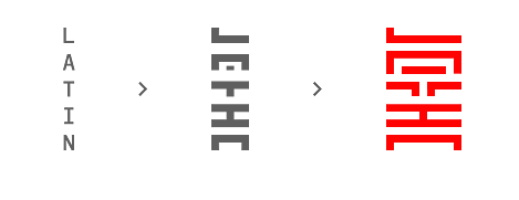
As you can guess it is an unusual type design with an experimental approach. Conventional shop sites wouldn’t be able to display or document it properly, so I built my own shop and implemented Sellfy in it.
How do you promote your products?
In the forefront of the release, I had the chance to exhibit the concept of Nihon at the „HfG Rundgang 2014“ in Offenbach, Germany, where I got a lot of positive feedback.
Later I promoted the project mostly via Behance and my website on which I published detailed documentation about the genesis and system behind it.
After its release on September 1, it got lots of attention, hundreds of tweets and was featured by several design blogs and sites, such as „Sidebar“, „Betype“, „Type Release“ or „Design Made in Germany“.
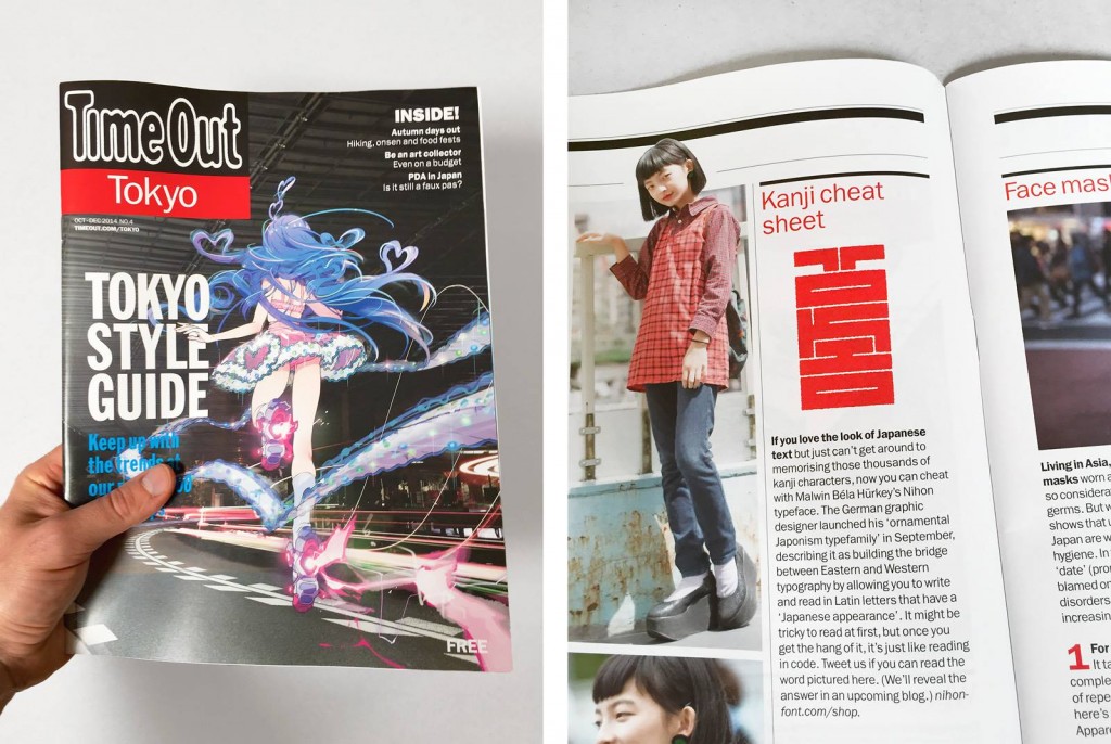
Moreover, there will be a short article in the upcoming TimeOut Magazine Tokyo this fall. All these streams combined generated very intensive traffic for the start of Nihon.
In short, I published documentation and told people about my project and the idea, rather than making actual advertising for it.
How have you built your audience and online presence?
I think you get the best audience when people start to talk about your product and are able to identify themselves with it, like it or even have some issues with it.
First of all, it was very helpful that they understood what I was doing, and more importantly, why I was doing it.
There are reasons why you start a project. You discover a problem you want to fix, a topic you want people to think about, to improve something, or you simply love to do something. The people you want to address should know about it to get a better understanding of your intentions.
When your audience is able to reconstruct your thoughts and discovers the solution you created, that’s when the „magic“ happens.
They will talk about the idea, with you or with others. Both are wonderful. So I talked with them, answered questions, discussed disagreements, explained my ideas and took all the feedback I could get. Whoever I was talking to, their opinion mattered.
It is simply a great experience to hear what people think about your project you put so much time and effort into. When they appreciate your work and the way you communicate the idea behind it, they will start to follow your project, maybe buy it and, in the best case scenario, even recommend it to their peers.
So, all in all, I used communication and storytelling as a tool to build my audience. And my online presence consists of the usual suspects for designers: Behance portfolio, online portfolio, Facebook page, and an Instagram account.
What’s the best feedback you received about your product?
This is definitely one of my favorites. It is an anonymous message I received on the first day of the release:
“Hello, my friend, and I just wanted to say how beautiful your typeface is! We are deeply inspired by Japanese calligraphy and design. While procrastinating instead of doing work, we stumbled upon it and we instantly fell in love. I, myself will purchase the typeface, and my friend is still considering it. Thank you for making such a beautiful typeface!”
What are some of your favorite places online where you go for insight or inspiration for your work?
I like to stumble upon unknown design projects or portfolios that didn’t get that much attention.
There are so many great designers we haven’t ever heard of. They are not easy to find and it is more of a lucky shot when you find such treasures online.
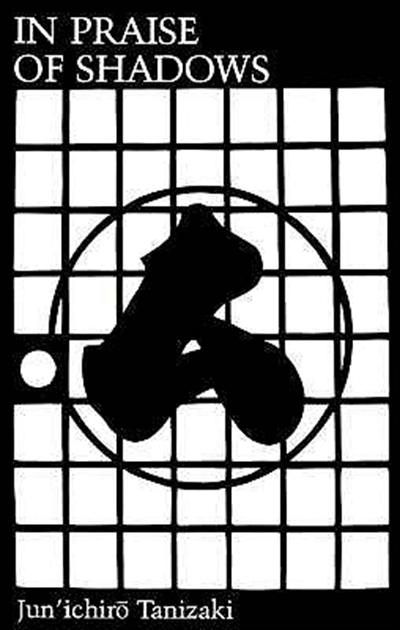
The most inspiration I got for Nihon was through a small book by Tanizaki Jun’ichirō called „In Praise of Shadows“. It’s not about typography or graphic design, it’s about Japanese aesthetics in general, and it caught my attention for Japanese design and culture.
I began to rummage Pinterest for Japanese typography, then books and exhibitions, and then I finally began to draw my first sketches for Nihon.
My favorite online inspirations are „But does it float“ and Pinterest, you can find nearly everything there.
Imagine that you can go back in time and give yourself advice about something. What would it be?
Grow a mustache, it’s freaking awesome! No seriously, I wish my earlier me would have taken advice. But I’ll try it.
Be critical to yourself and the work you do. Stay curious and open-minded to new ideas. Find your passion in the detail. Don’t believe the hype. Be brave and walk paths no one has ever taken before.
Oh – and I should have eaten onions earlier. I used to hate them as a kid, now I love them.


